
Wizardry 2.0 Webflow Integration
🌎Wizardry is a responsive EM approach that scales like VW but has a maximum width.
Wizardry 2.0 brings intelligent, responsive spacing to Webflow projects by combining the fluid scalability of viewport-based units with the practical control of maximum width constraints.
Unlike traditional VW units that can grow uncomfortably large on wide screens or REM units that lack true fluidity, Wizardry uses a responsive EM approach that automatically scales spacing, padding, and margins proportionally across breakpoints while capping at a defined maximum. This means your Webflow site maintains perfect visual rhythm on mobile and tablet devices, scales smoothly on laptops, and stays elegantly constrained on ultra-wide monitors—all without writing complex custom code or managing multiple breakpoint overrides. The system is particularly valuable for maintaining consistent vertical rhythm in typography-heavy sites, creating harmonious component spacing in design systems, and ensuring that white space feels intentional across every screen size.
Compared to manually adjusting spacing classes at each Webflow breakpoint or relying on rigid pixel values, Wizardry dramatically reduces the time spent fine-tuning responsive layouts while producing more mathematically consistent results. It's ideal for Webflow designers and agencies building scalable design systems, as well as freelancers who want professional-grade responsive behavior without the maintenance overhead of breakpoint-specific spacing adjustments.
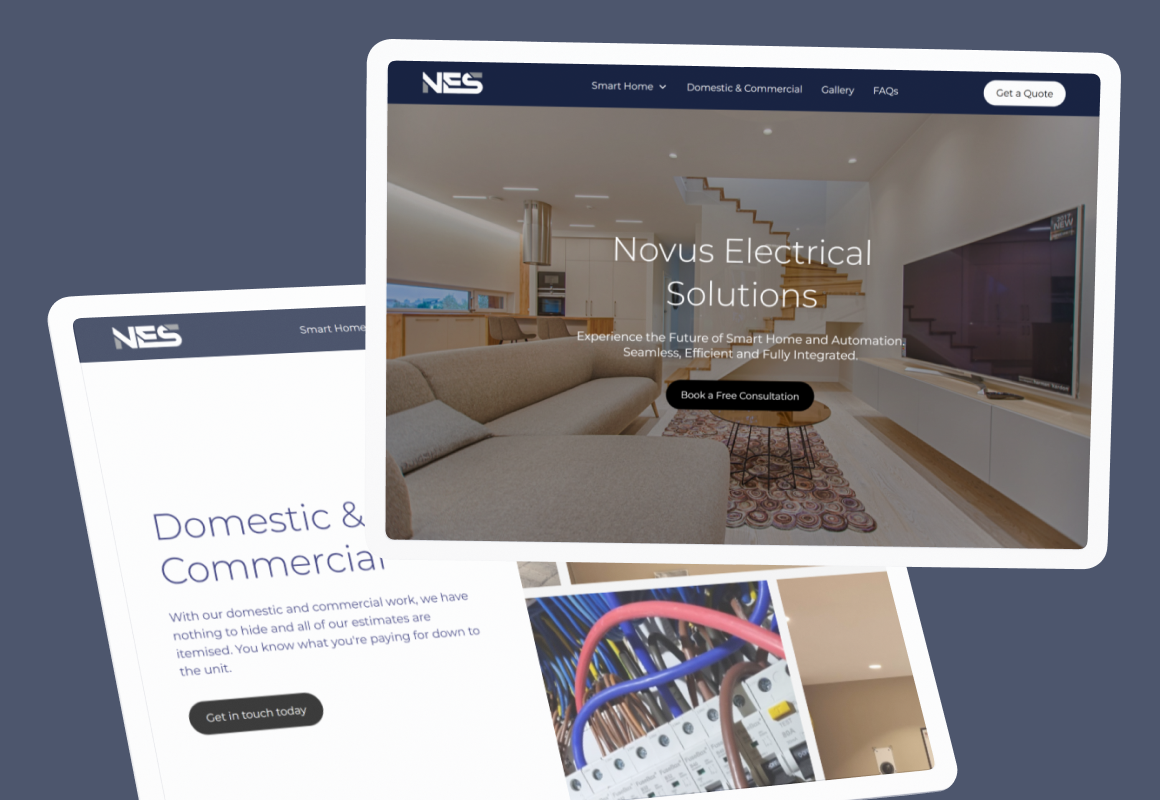
Recent builds that deliver


Clients I've helped ship better Webflow sites
"As I grow in my business, I need services to grow with, Derrick is that service when it comes to my website. He is patient, listens and takes onboard the changes I want in a timely manner. My website changes and develops with the needs of my clients and my offer which is great. He also brings new ideas and perspectives in how to improve and grow in line with my goals and business needs. I look forward seeing how this new phase develops."

Karin Young
Psychotherapist · Karin Counselling

"Derrick has been a great help in getting our SaaS website up and running. He is very knowledgeable in Webflow and was able to help us get the most out of the platform. His design skills are excellent and he was able to create a custom function-filled website that looks great and operates perfectly. I would highly recommend Derrick to anyone looking for a web designer who knows his stuff!"

Taita Ngetich
CEO · Synnefa

"Derrick is just great to work with! He's super fast, always responds in a timely manner, and is very flexible with last-minute requests. His Webflow development skills are rock solid and he has no problems keeping up with the fast pace of early-stage startups."

Carla Nassisi
Growth · Briink

"It has been a pleasure to work with Derrick! He delivered a pixel-perfect website for LLI, which not only looks and performs well but is also very organised and simple to maintain! During the process, he had the patience to clear all the incoming doubts that occurred when we were transitioning from one platform to another, and he not only delivered a great site but also tutorials on how to manage it."

Isabelle Krauze
UX Lead · LLInformatics

"Derrick is a gem of a person and a wealth of knowledge. He was so patient and helpful when explaining the more intricate parts of Webflow and bouncing around different possible solutions. He really knows the ins and outs of Webflow — it's no wonder that he's a certified Webflow Expert! I'm looking forward to the day when I get to work with him again."

Diana Donaldson
CEO · Be Indigo
"Derrick helped us redesign and build our site on Webflow and we couldn't be more pleased with the entire project. Derrick is very easy to communicate with, fast and efficient, and takes time to ask questions and provide suggestions where necessary. He has a great balance of technical and visual knowledge, which helped us build a fast, SEO-optimized site that looks great and is on-brand. Would happily hire Derrick again!"

Eliza Gerland
Strategic Marketer · UFODrive

"Derrick and his team were wonderful to work with and helped us a lot with launching multiple Webflow projects in addition to doing a full website backend revamp. Recommend him to anyone!"

Liza Moiseeva
CMO · Commons

"Derrick and his colleague were tasked with helping to implement new designs for our Home and Product pages on our website. We had a super tight deadline and they took it in their stride. Their communication throughout the project was great and the results were fantastic. Would highly recommend."

Marcus Vitelli
Brand Executive · Flexciton
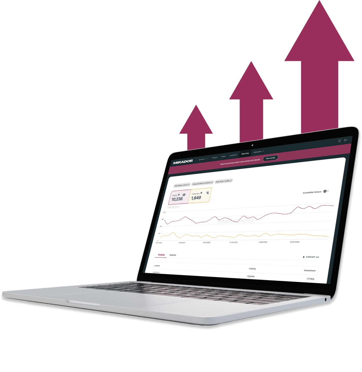
"Derrick translated our ideas into visually stunning designs. He took our vision for Mirador Local's online presence and brought it to life in a way that exceeded our expectations. I highly recommend him to anyone seeking a talented and reliable designer for their next project."

Gerry White
Global Growth · Mirador
"Derrick has a solid and broad understanding of Webflow and has delivered huge improvements to our website."

Tim Sater
Marketing Lead · Provenance
"Derrick and his team did a great job building our marketing site and leaving us with the tools to sustainably iterate on our website. They didn't stop until the site perfectly matched our design vision. We would definitely work with them again!"

John Outwater
Data Visualization · Renoster

"Derrick made our vision a reality, he's simply a brilliant website developer. We're incredibly happy with the results, which match the designs. If you're a startup or scale-up looking for an excellent web developer to turn your ideas into reality, look no further!!"

Ben Leftley
Senior Delivery Manager · Unmind
"It was great working with Derrick’s team! Communication was smooth and the website ideation, design and development were executed well without much hiccups. Will highly recommend for your website projects! :)"

Indra Basak
Marketing · PreciX
"Derrick was conscientious, efficient and delivered on time. Communication was effective and they really understood the issues at hand. He ultimately delivered a professional looking website that exceeded expectations."

Miles Owen
Head of Digital · FMpay
"As I grow in my business, I need services to grow with, Derrick is that service when it comes to my website. He is patient, listens and takes onboard the changes I want in a timely manner. My website changes and develops with the needs of my clients and my offer which is great. He also brings new ideas and perspectives in how to improve and grow in line with my goals and business needs. I look forward seeing how this new phase develops."
Karin Young
Psychotherapist · Karin Counselling
"Derrick has been a great help in getting our SaaS website up and running. He is very knowledgeable in Webflow and was able to help us get the most out of the platform. His design skills are excellent and he was able to create a custom function-filled website that looks great and operates perfectly. I would highly recommend Derrick to anyone looking for a web designer who knows his stuff!"
Taita Ngetich
CEO · Synnefa
"Derrick is just great to work with! He's super fast, always responds in a timely manner, and is very flexible with last-minute requests. His Webflow development skills are rock solid and he has no problems keeping up with the fast pace of early-stage startups."
Carla Nassisi
Growth · Briink
"It has been a pleasure to work with Derrick! He delivered a pixel-perfect website for LLI, which not only looks and performs well but is also very organised and simple to maintain! During the process, he had the patience to clear all the incoming doubts that occurred when we were transitioning from one platform to another, and he not only delivered a great site but also tutorials on how to manage it."
Isabelle Krauze
UX Lead · LLInformatics
"Derrick is a gem of a person and a wealth of knowledge. He was so patient and helpful when explaining the more intricate parts of Webflow and bouncing around different possible solutions. He really knows the ins and outs of Webflow — it's no wonder that he's a certified Webflow Expert! I'm looking forward to the day when I get to work with him again."
Diana Donaldson
CEO · Be Indigo
"Derrick helped us redesign and build our site on Webflow and we couldn't be more pleased with the entire project. Derrick is very easy to communicate with, fast and efficient, and takes time to ask questions and provide suggestions where necessary. He has a great balance of technical and visual knowledge, which helped us build a fast, SEO-optimized site that looks great and is on-brand. Would happily hire Derrick again!"
Eliza Gerland
Strategic Marketer · UFODrive
"Derrick and his team were wonderful to work with and helped us a lot with launching multiple Webflow projects in addition to doing a full website backend revamp. Recommend him to anyone!"
Liza Moiseeva
CMO · Commons
"Derrick and his colleague were tasked with helping to implement new designs for our Home and Product pages on our website. We had a super tight deadline and they took it in their stride. Their communication throughout the project was great and the results were fantastic. Would highly recommend."
Marcus Vitelli
Brand Executive · Flexciton
"Derrick translated our ideas into visually stunning designs. He took our vision for Mirador Local's online presence and brought it to life in a way that exceeded our expectations. I highly recommend him to anyone seeking a talented and reliable designer for their next project."
Gerry White
Global Growth · Mirador
"Derrick has a solid and broad understanding of Webflow and has delivered huge improvements to our website."
Tim Sater
Marketing Lead · Provenance
"Derrick and his team did a great job building our marketing site and leaving us with the tools to sustainably iterate on our website. They didn't stop until the site perfectly matched our design vision. We would definitely work with them again!"
John Outwater
Data Visualization · Renoster
"Derrick made our vision a reality, he's simply a brilliant website developer. We're incredibly happy with the results, which match the designs. If you're a startup or scale-up looking for an excellent web developer to turn your ideas into reality, look no further!!"
Ben Leftley
Senior Delivery Manager · Unmind
"It was great working with Derrick’s team! Communication was smooth and the website ideation, design and development were executed well without much hiccups. Will highly recommend for your website projects! :)"
Indra Basak
Marketing · PreciX
"Derrick was conscientious, efficient and delivered on time. Communication was effective and they really understood the issues at hand. He ultimately delivered a professional looking website that exceeded expectations."
Miles Owen
Head of Digital · FMpay
Wizardry 2.0 FAQs
Common questions about using Wizardry 2.0 with Webflow.
Wizardry 2.0 is a responsive sizing technique that uses EM units with a clamp-like behavior. Implement it in Webflow by setting up custom EM-based sizing for typography and spacing that scales responsively but stops at a maximum width, providing better control than pure VW units.
Wizardry 2.0 provides responsive scaling with built-in maximum width constraints, preventing text and elements from growing too large on ultra-wide screens. This creates more predictable, accessible designs compared to viewport-width units while maintaining fluid responsiveness across standard device sizes.
Create fluid typography systems that scale smoothly between mobile and desktop without becoming too large on wide monitors. Build spacing scales that adapt to viewport size while maintaining readability and hierarchy. It's ideal for creating responsive component libraries with predictable sizing behavior.
Basic understanding of CSS units (EM, REM, VW) is helpful, but Wizardry 2.0 can be implemented using Webflow's visual Designer by setting appropriate EM values on elements. Understanding the technique's principles helps you apply it effectively across your project's typography and spacing systems.
Need Wizardry 2.0 on your Webflow site?
I integrate tools like this for clients all the time. Talk to me about your setup.