Picking the right font for your UI
%20(1).avif) Written by Derrick Kityo
Written by Derrick KityoYou want a font that enhances the experience of your user but also makes sure people read what you have to say.
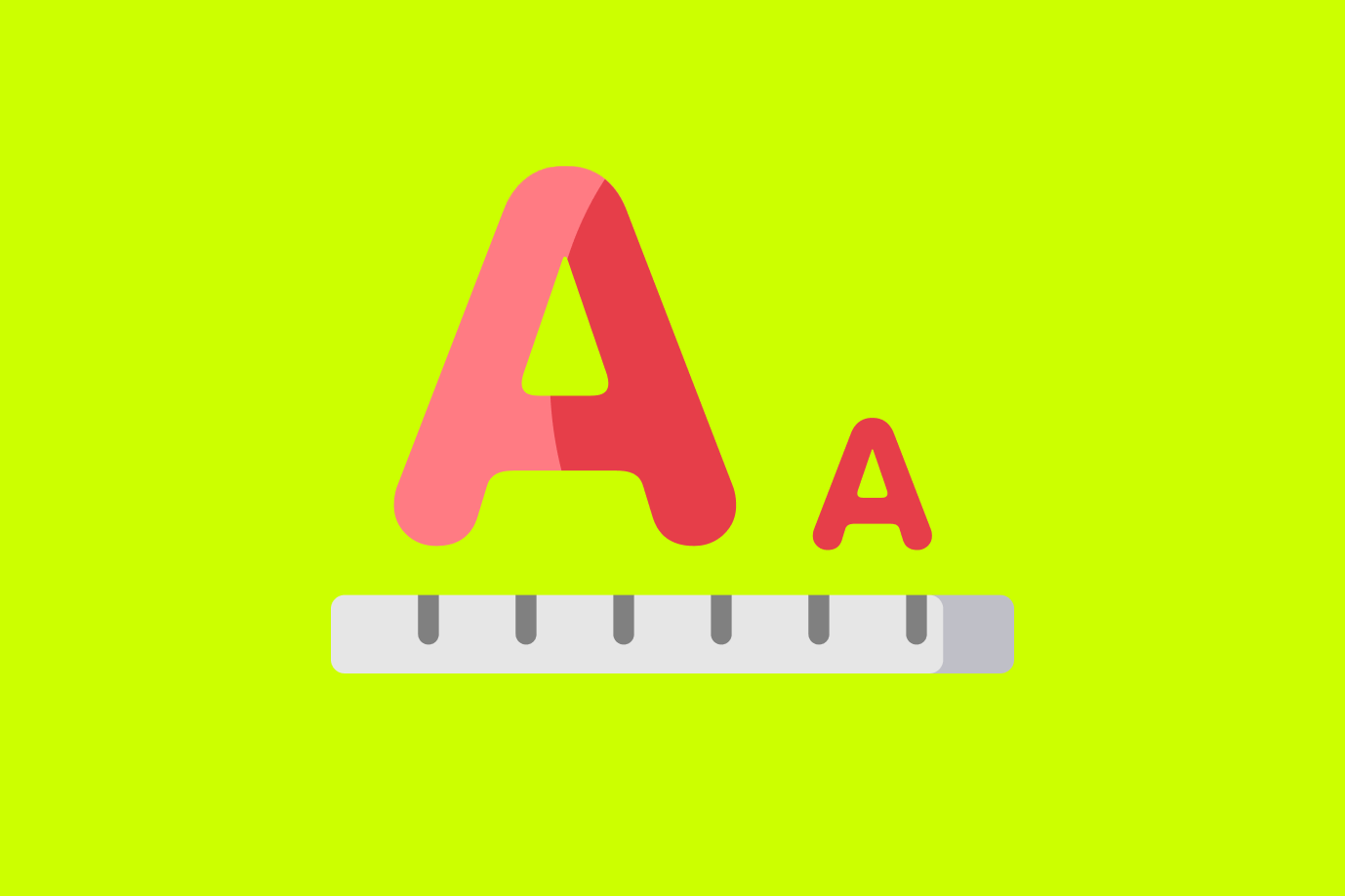
When picking a font for your web project it's all about balance of beauty and usability.
You want a font that enhances the experience of your user but also makes sure people read what you have to say.
Make sure you pick a UI friendly font with proper spacing, legibility, lack of ambiguity and no unnecessary flourishes or decoration.
Here are 10 fonts that will make your website look good and do its job effectively.
All of these are available for free through Google Fonts except Avenir, which is a paid font by Linotype.
I've used all of them at some point or another with success, so here's my take on them.
Lato
Lato is a sans-serif font that's humanist in nature, meaning it has rounded stroke endings instead of sharp angles.
It was designed in 2010 by Warsaw-based Łukasz Dziedzic and comes in a variety of styles from thin to black to extra bold.
The font has become very popular over the last few years, partly because it's open source and free for commercial use.
Open Sans
Open sans is another humanist sans-serif font with clean lines and curves. It comes in nine different weights making it versatile enough for extensive web use. You'll see it everywhere these days; it was created by Steve Matteson who also made Droid Serif (the font used on this blog) as well as other Google Fonts like Roboto Slab, Raleway and PT Serif (used throughout this article).
Merriweather Sans/Serif
riweather is a serif and sans-serif font with a warm and friendly style. It's perfect for websites that want to give off an inviting tone, like those selling children's toys or winter apparel.
Roboto Mono/Sans
Roboto is Google's take on Helvetica as a monospace font (which means each character takes up the same width). It's used in Android OS and comes in thinner and bolder styles as well as a rounded version called Roboto Slab.
PT Serif
PT Serif is another serif font that was specifically designed for larger bodies of text and headlines rather than body copy (more on this later). I've seen it combined with Open Sans quite often, in various weights.
Raleway Serif
Raleway is another font created for Google Fonts by Matteson (see Open Sans above). It comes in both sans-serif and serif faces like Roboto Mono. The difference between the two is the serif version has more traditional features like small lines on each corner of letters like 'a' or 'm.'
Corbel
Corbel is a beautiful font that looks great at smaller sizes but also works well with large text blocks. This one's far from free though; it can be purchased through Adobe's Typekit program which requires monthly payments to use the full range of styles available. If you do get it, I highly recommend using the italic and bold weights for your body copy.
Droid Sans Mono/Serif
Droid Sans is a sans-serif font that's relatively readable at smaller sizes and makes great headlines combined with Roboto Mono (see above). Like Roboto it comes in sans-serif and serif versions as well as lighter weight styles like extra light or thin. The serif version isn't as clean as PT Serif though; there are some details around the edges of letters like 'a' but overall it's not too bad to work with.
Source Sans Pro Light/Pro Medium/Pro Semibold/Pro Bold
Source Sans Pro is a versatile font available in a number of weights. It's got a simple, modern style and works well on the web with both sans-serif and serif faces.
Cantarell
Cantarell is a more popular font that works well for both large and smaller text blocks throughout your page. It comes in four different weights from light to bold and has been used by websites like Spotify, GQ Magazine and The Guardian .
Fonts are an important part of any design, and it’s especially important to pick the right font for your website or marketing materials. Not every font will be appropriate for all situations, so it’s important to do some research and find one that will be liked by your target audience. If you need help finding the right font for your next project , contact me – I would love to assist you!

.jpg)