7 Web Design Examples That Convert (2025 UK Edition)
Discover 7 standout web design examples that blend creativity with conversions. Get actionable insights and Webflow tips for your next UK project.
Finding exceptional web design examples is simple, but understanding the strategy behind their success is the key to building a site that performs. A beautiful interface is only part of the equation; effective design must be rooted in strategic decisions that guide user behaviour, communicate value clearly, and ultimately drive business growth. It's about translating visual appeal into measurable outcomes.
This curated listicle moves beyond surface-level aesthetics to deconstruct what makes a website truly effective. We will analyse seven standout examples, pinpointing the specific user experience (UX) patterns, conversion-focused tactics, and technical foundations that contribute to their high performance. For each example, you’ll find direct links and screenshots, allowing you to explore them firsthand.
Our goal is to equip you with actionable insights, not just inspiration. We'll break down the strategic thinking behind each design and provide practical notes on how you can replicate these successful patterns, particularly for UK businesses using Webflow. This analysis will help you build a marketing site that not only captures attention but also converts visitors into loyal customers. For a deeper understanding of optimising your online presence, consult this practical guide on how to improve conversion rates. Let’s dive into the examples that master the art of turning clicks into customers.
1. Derrick.dk — The Developer-Led Studio
For businesses seeking web design examples that seamlessly blend aesthetic precision with technical performance, Derrick.dk is a standout showcase. Led by certified Webflow expert Derrick Kityo, this London-based studio exemplifies a developer-first approach to building conversion-focused websites. Their portfolio serves as a masterclass in creating marketing sites that are not only visually striking but also engineered for speed, search engine optimisation, and long-term scalability.
The studio's work demonstrates a rare fusion of pixel-perfect design translation and robust, clean Webflow development. This makes it an essential resource for SaaS companies, startups, and marketing teams who need more than just a beautiful facade; they need a high-performing digital asset that drives business goals. The site itself is a testament to this philosophy, featuring a clean layout, lightning-fast load times, and crystal-clear messaging that guides users toward a single call-to-action: booking a diagnostic call.

Strategic Analysis: The Developer-Led Advantage
What sets Derrick.dk apart in a crowded field of web design examples is its foundational emphasis on development best practices. While many agencies lead with design and treat development as a secondary implementation step, Derrick.dk integrates technical strategy from the very beginning. This developer-led model ensures that every design choice is vetted for performance, accessibility, and maintainability.
Key Strategic Insight: By positioning development as a core strategic pillar rather than a final production stage, the studio builds sites that are inherently more reliable and easier for client teams to manage post-launch. This prevents common issues like bloated code, slow page speeds, and a disorganised CMS that can cripple a marketing team's agility.
Tactical Breakdown & Replicable Patterns
Derrick.dk's portfolio consistently showcases several high-impact tactics that any business can learn from. These patterns are particularly effective for organisations focused on lead generation and brand clarity.
- Conversion-Centric UX: The user journey on client sites is meticulously crafted. Notice the clear visual hierarchy, unambiguous calls-to-action (CTAs), and strategic use of social proof (testimonials and case studies) placed near key decision points.
- Performance as a Feature: Websites are built with a fanatical focus on speed. This includes optimising images, leveraging clean Webflow builds, and minimising code bloat to achieve excellent Core Web Vitals scores, which directly impacts SEO rankings and user experience.
- Scalable CMS Collections: The back-end of their projects is organised for client empowerment. They build flexible and intuitive Content Management Systems (CMS) in Webflow, allowing marketing teams to update content, add blog posts, or publish case studies without needing a developer for every small change.
How to Replicate This in Webflow
If you're looking to implement a similar strategy, focus on these actionable steps within your Webflow project:
- Prioritise a "Style System": Before building pages, create a comprehensive style guide in Webflow. Define global colours, typography (H1, H2, paragraph), button styles, and class naming conventions. This ensures consistency and makes future updates far more efficient.
- Build a Component-Based Library: Instead of building page by page, create reusable components for elements like navigation bars, footers, testimonial sliders, and CTA sections. This modular approach, using Webflow's Components feature, speeds up development and guarantees brand consistency.
- Conduct a Pre-Launch Performance Audit: Use Google's PageSpeed Insights and Webflow's built-in Audit panel to identify performance bottlenecks. Compress all images before uploading, lazy-load images below the fold, and ensure any custom code is lightweight and efficient.
Website: https://derrick.dk
Best For:
- Startups and SaaS companies needing a fast, SEO-optimised Webflow site.
- Marketing teams requiring a reliable partner for ongoing site maintenance and iteration.
- Agencies looking for expert Figma-to-Webflow development support.
2. Awwwards
Awwwards is an internationally recognised body for digital design and development, serving as a benchmark for innovation and creativity in the web industry. It operates as a dynamic, curated gallery where agencies, designers, and developers submit their work to be judged by an international jury of experts. This platform is not just a showcase; it's a competitive arena where the best of the best are awarded accolades like Site of the Day (SOTD), setting the standard for current web design examples.
Its core function is to provide a constant stream of high-calibre inspiration. By meticulously curating and awarding projects, Awwwards gives designers a reliable source for observing emerging trends, advanced animation techniques, and groundbreaking user interface patterns. Unlike more generalist inspiration platforms, its rigorous judging process ensures that every featured site has been vetted for its usability, creativity, content, and design.
Strategic Analysis & Actionable Takeaways
Awwwards excels by creating a self-sustaining ecosystem of recognition and education. The prestige associated with an award motivates studios to submit their most ambitious work, which in turn elevates the quality of the gallery for everyone seeking inspiration. This model makes it a definitive resource for any marketing team or startup wanting to understand what a truly world-class website looks and feels like.
Conversion & UX Insights:
- Study the Winners: Don't just browse; dissect the Site of the Day winners. Pay close attention to their onboarding flows, call-to-action (CTA) placements, and micro-interactions. These sites often master the balance between creative expression and conversion-focused design.
- Analyse User Journeys: Pick a featured website in your industry and map out its primary user journey. How does it guide visitors from the homepage to a key conversion point? Note the use of visual hierarchy, compelling copy, and interactive elements.
- Deconstruct Trend-Setting Patterns: Awwwards is a fantastic place to spot emerging trends like kinetic typography, advanced scroll-triggered animations, and immersive 3D elements. Consider how these can be adapted (in a more subtle way) to enhance your brand's story without overwhelming users. For more information, you can find further insights into using Awwwards as one of many web design sites for inspiration.
How to Use Awwwards Effectively:
To get the most out of the platform, move beyond passive scrolling. Use the advanced filtering to search by category, technology (e.g., Webflow), colour, and country. This allows you to find highly relevant web design examples that align with your specific project needs. For teams looking to upskill, the Awwwards Academy offers courses taught by industry leaders, providing structured learning paths on topics from WebGL to creative coding. Submitting a site for an award costs around €50, offering a tangible way to get your work in front of a global audience and receive expert feedback.
3. SiteInspire
SiteInspire is a highly respected and meticulously curated gallery of inspirational websites, operated from London. For over a decade, it has served the design community as a definitive library of web design, favouring clean aesthetics, strong typography, and intelligent layouts over fleeting trends. Its strength lies in its powerful, multi-faceted filtering system, which allows designers and developers to pinpoint specific examples with remarkable precision.
The platform's core purpose is to provide a focused, distraction-free environment for creative discovery. Unlike broader, more competitive galleries, SiteInspire’s curation feels more editorial, emphasising quality and timelessness. This makes it an invaluable resource for finding web design examples that solve real-world problems in specific niches, from editorial layouts to minimalist e-commerce stores, without the noise of award-driven submissions.
Strategic Analysis & Actionable Takeaways
SiteInspire's value proposition is its utility and speed. By stripping away non-essential features, it enables users to move from a vague idea to a collection of highly relevant visual references in minutes. This focus on functional discovery makes it a go-to tool for the initial phases of a project, where establishing a clear visual direction is paramount for marketing teams and startups.
Conversion & UX Insights:
- Master Niche Patterns: Use the filter to isolate specific project types, such as "Portfolio" or "E-commerce." Analyse the common patterns in navigation, product display, and CTA design within these niches to understand user expectations and established best practices.
- Study Grid and Layout Systems: SiteInspire's collection excels at showcasing effective grid-based designs. Analyse how different sites use grids to create visual hierarchy and guide the user’s eye through content. This is a foundational skill for creating organised, scalable, and conversion-friendly layouts.
- Analyse by Subject: The "Subject" filter is a powerful tool for competitive analysis. Search for websites in your industry to see how competitors are structuring their information, presenting their value propositions, and designing their user journeys. Note their approach to typography and colour to inform your own brand's digital presence.
How to Use SiteInspire Effectively:
To maximise its potential, use the filtering system as your primary tool. Combine filters like Style (e.g., "Minimal"), Type (e.g., "Corporate Site"), and Platform (e.g., "Webflow") to narrow down thousands of examples to a handful of perfect matches for your project. The platform is free to browse, and its extensive historical archive allows you to track the evolution of design patterns over time. Create a free account to save your favourite sites into collections, building a personalised mood board for your next project.
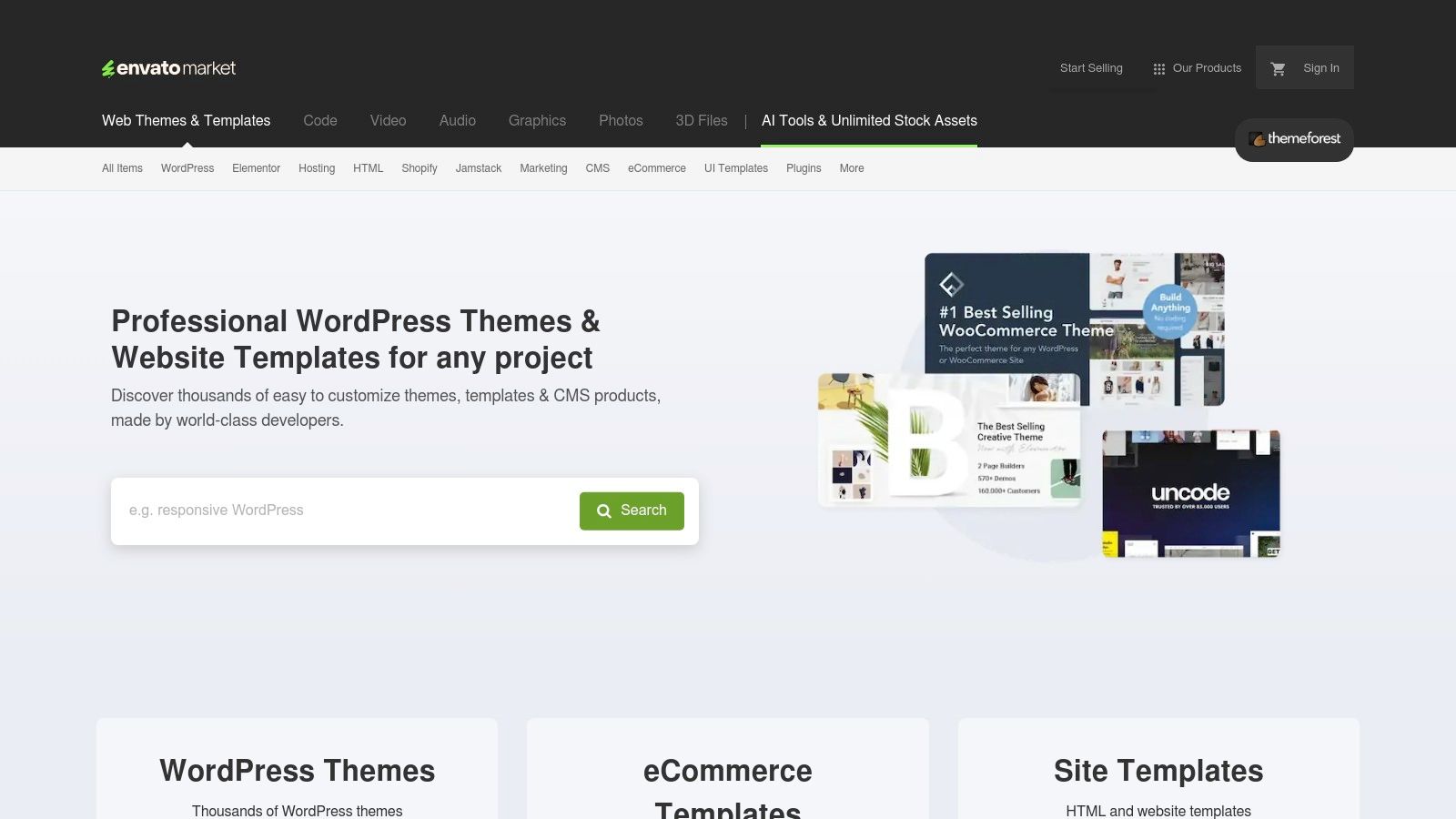
4. ThemeForest (by Envato)
ThemeForest, part of the Envato Market ecosystem, is one of the world's largest marketplaces for website themes and templates. It serves as a vast digital library where developers and designers sell pre-built designs for a wide range of platforms, including WordPress, Shopify, and static HTML. For teams needing a quick start or a solid foundation, ThemeForest provides a massive catalogue of commercially available options that can be purchased, customised, and launched rapidly.
Its primary function is to bridge the gap between high-cost custom development and the need for a professional, feature-rich website. By offering thousands of templates complete with ratings, user reviews, and live previews, it enables businesses to find and evaluate designs that fit their specific industry and functional requirements. Unlike curated inspiration galleries, ThemeForest is a practical resource focused on providing tangible, ready-to-deploy digital assets, making it a go-to for many startups and small businesses.
Strategic Analysis & Actionable Takeaways
ThemeForest's strategic strength lies in its sheer volume and competitive pricing, driven by a global community of creators. This model creates a marketplace where businesses can find highly specific niche themes, from real estate portals to restaurant booking systems, at a fraction of the cost of bespoke design. For marketers, it serves as an excellent tool for rapidly prototyping ideas or launching campaign-specific landing pages without significant upfront investment.
Conversion & UX Insights:
- Reverse-Engineer Top Sellers: Analyse the best-selling themes in your category. These themes are popular for a reason; they often have highly optimised user flows, clear information architecture, and conversion-centric layouts that have been refined based on feedback from thousands of buyers.
- Evaluate Live Previews for UX Patterns: Use the "Live Preview" feature extensively. Interact with the demos as a real user would, noting the navigation structure, CTA button styles and placements, and the overall user experience. This provides excellent real-world web design examples for common UX patterns.
- Focus on Customisability vs. Complexity: The best themes balance a rich feature set with ease of use. When selecting a theme, look for those with well-documented customisation options and a clean codebase. An overly complex theme can be difficult to manage and slow down your site, negatively impacting both UX and SEO.
How to Use ThemeForest Effectively:
To maximise the value of ThemeForest, use the filters to narrow your search by platform, category, price, and sales volume. Always check the item's rating, comments section, and the author’s portfolio to gauge quality and support responsiveness. Pay close attention to the "Last Update" date and the change log to ensure the theme is actively maintained. While ThemeForest is a great starting point for many platforms, those looking for highly customisable, no-code solutions might explore other avenues. For those specifically in the Webflow ecosystem, you can discover more about where to find Webflow templates to compare specialised offerings. Licenses typically start from around $20-$80 for a single-site regular license.
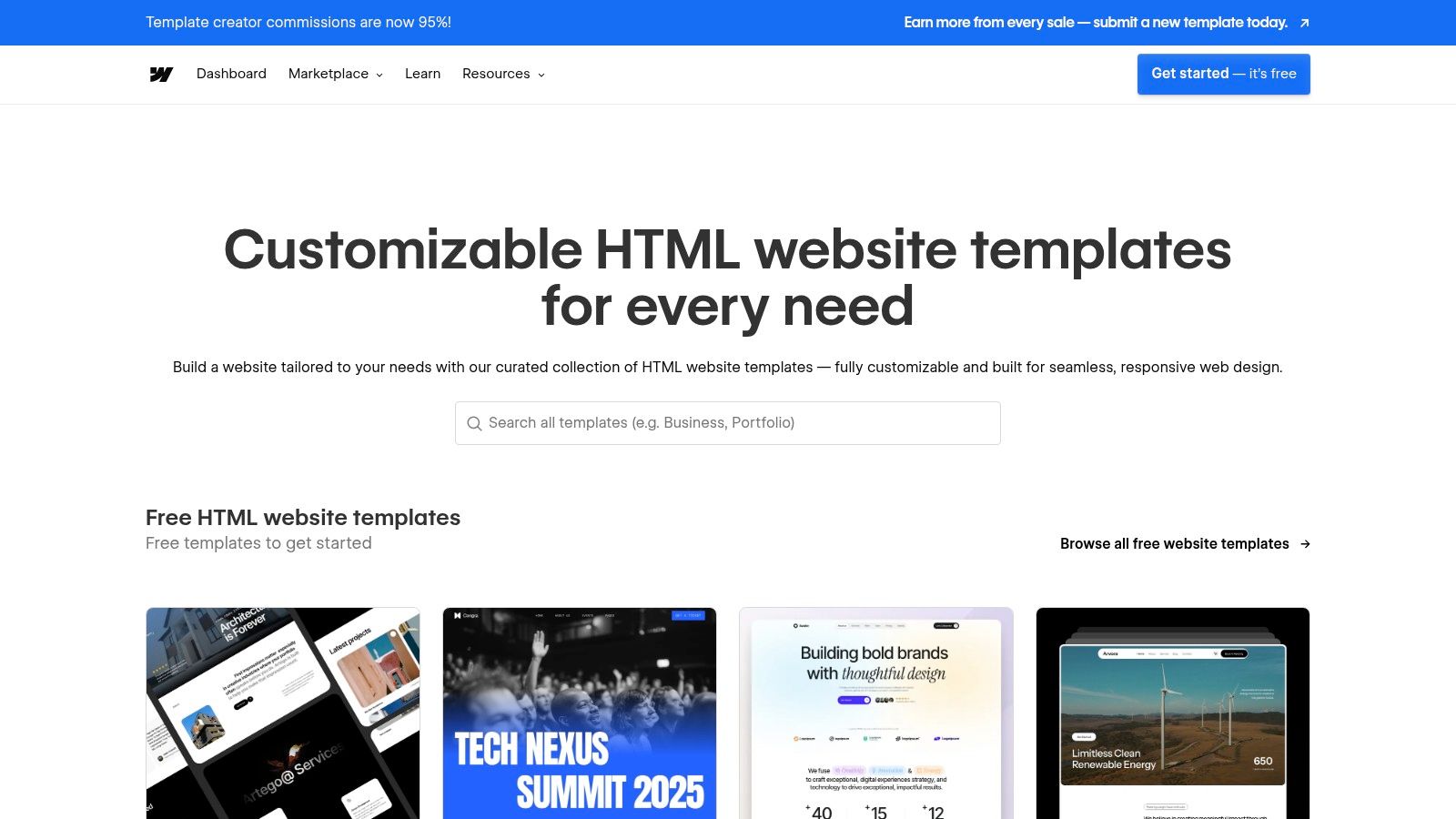
5. Webflow (Templates + Showcase)
Webflow has fundamentally changed the landscape of web design by bridging the gap between high-fidelity design tools and production-ready websites. It provides a dual-purpose platform for inspiration and creation: a premium Template Marketplace for ready-to-customise sites and a public Showcase where designers and developers share live projects, many of which are "clonable." This combination makes it a powerful resource for anyone looking to build a professional website without writing code.
Its core value lies in democratising access to high-calibre web development. Unlike simpler builders, Webflow offers deep control over HTML, CSS, and JavaScript through a visual interface, allowing for sophisticated animations, interactions, and layouts. The Showcase acts as a living library of web design examples, where users can not only see what's possible but also look under the bonnet, clone a project, and deconstruct how it was built.
Strategic Analysis & Actionable Takeaways
Webflow’s ecosystem thrives by empowering its community to both learn from and contribute to a vast collection of real-world projects. The ability to clone a showcased site provides an unparalleled learning opportunity, allowing you to reverse-engineer complex interactions or use a proven layout as a starting point. For businesses, the Template Marketplace offers a significant head start, providing a designer-grade foundation that can be customised to fit specific brand and conversion goals.
Conversion & UX Insights:
- Reverse-Engineer Top Performers: Find a clonable project in the Showcase that aligns with your industry. Clone it into your Webflow account to explore its structure, interaction triggers, and responsive settings. This hands-on analysis is far more insightful than just observing a live site.
- Focus on Template Foundations: When choosing a template, look beyond aesthetics. Analyse its Content Management System (CMS) structure, page layouts (especially for blogs and case studies), and built-in components. A well-structured template will save you countless hours in development.
- Adapt, Don't Just Copy: Use clonable projects as a framework for learning specific techniques, such as a unique navigation bar or a scroll-based animation. Isolate that single element and learn how to build it yourself, rather than using the entire cloned site wholesale. This builds your skills and ensures your final design is unique.
How to Use Webflow Effectively:
To maximise Webflow's potential, filter the Showcase by "Most Liked" or "Made in Webflow" to find community-vetted designs. For those exploring Webflow's innovative designs, understanding how to apply strategies like optimising your Webflow site for search engines with Indexnow can ensure your clonable projects gain necessary search visibility. Premium templates are a one-time purchase, typically ranging from $49 to $149, while publishing a site requires a separate Webflow hosting plan (starting from around $14/month, billed annually). This investment provides a fast-track to launching a professional, high-performing website. For more inspiration, you can explore some of the best Webflow websites built by top agencies and designers.
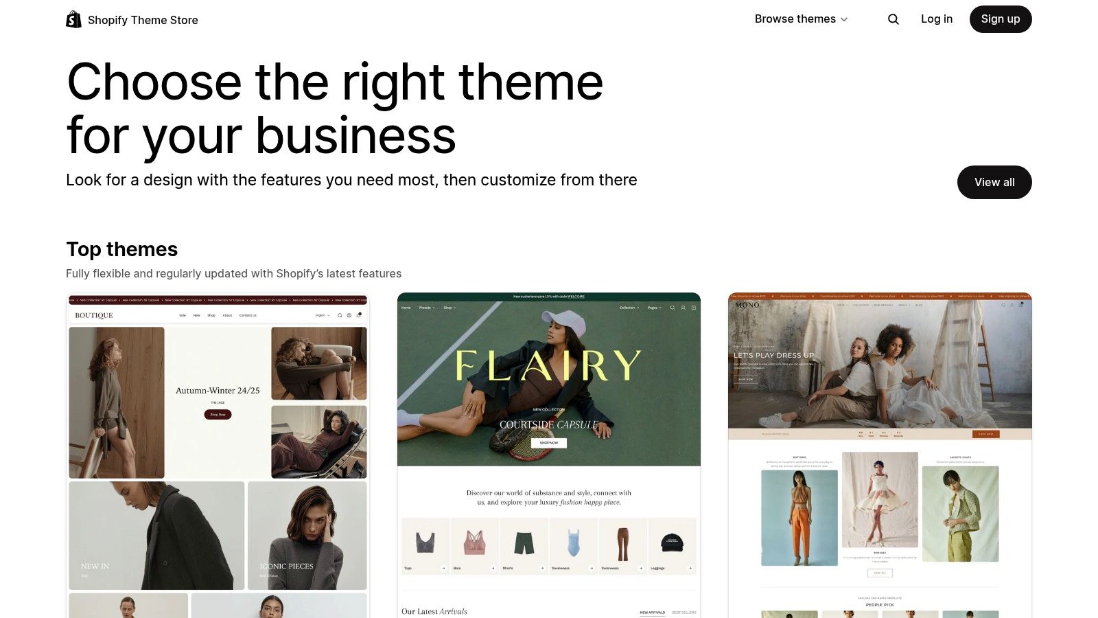
6. Shopify Theme Store
The Shopify Theme Store is the official marketplace for professionally designed e-commerce templates, offering a direct line to high-quality, conversion-optimised store layouts. It functions as a curated gallery where merchants can browse, preview, and purchase themes built specifically for the Shopify platform. Each theme comes with a live demo, allowing users to experience the design and functionality as a customer would, making it a valuable resource for e-commerce web design examples.
Its core purpose is to provide a reliable and secure foundation for online stores, ensuring seamless integration with Shopify’s powerful features, including its fast checkout and Online Store 2.0 capabilities. Unlike general template marketplaces, every theme in the Shopify store undergoes a strict review process, guaranteeing a high standard of performance, mobile responsiveness, and developer support. This focus on quality and platform-specific optimisation makes it an essential starting point for anyone looking to build a successful online retail presence.
Strategic Analysis & Actionable Takeaways
The Shopify Theme Store's strength lies in its ecosystem of trust and specialisation. By vetting all themes for performance and adherence to best practices, it de-risks the process of launching an online store. Merchants can invest in a premium theme with confidence, knowing it will be updated and supported. This model provides a practical library of proven designs that balance aesthetic appeal with the critical demands of e-commerce usability and conversion.
Conversion & UX Insights:
- Analyse Product Detail Pages (PDPs): Explore the live demos and pay close attention to the PDP layouts. Note how they use high-quality imagery, clear pricing, variant selectors, trust badges, and prominent "Add to Cart" buttons to reduce friction and encourage purchases.
- Study Collection Page Filtering: The most effective themes offer intuitive filtering and sorting options on collection pages. Analyse how they handle large inventories, allowing users to quickly narrow down choices by size, colour, price, or other attributes. This is a key UX pattern for maximising sales.
- Observe Upsell and Cross-Sell Placements: Successful themes often integrate "You might also like" sections or "Frequently bought together" modules seamlessly. Identify where these are placed within the user journey (e.g., on product pages or in the cart) to increase the average order value.
How to Use the Shopify Theme Store Effectively:
To maximise the store's potential, use the detailed filters to find themes tailored to your industry, catalogue size, and desired features (like a quick-buy option or in-store pickup). Before committing, use the "Try theme" feature to apply it to your own store and customise it with your branding and products. This allows for a comprehensive evaluation of its suitability. Themes are a one-time purchase, typically ranging from $180 to $350, and include free updates, offering long-term value. Reading reviews and checking the theme's changelog provides crucial insight into the developer's support and commitment to improvements.
7. Creative Market
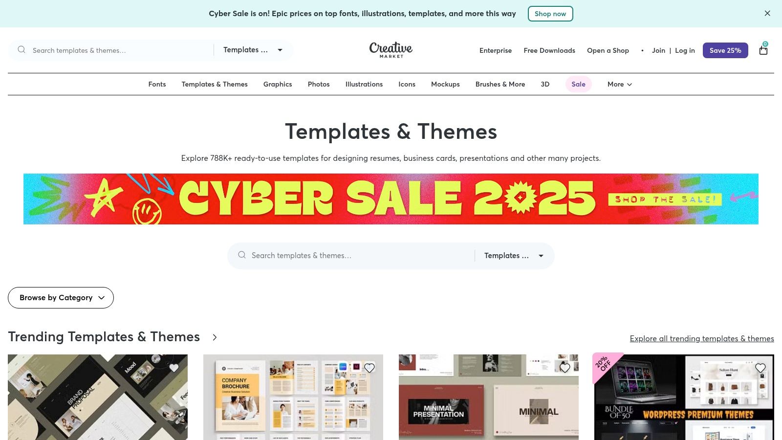
Creative Market is a vast online marketplace for design assets, offering a shortcut for businesses and designers looking to implement high-quality aesthetics without starting from scratch. It connects independent creators with buyers, providing a rich library of website templates, UI kits, fonts, icon sets, and mockups. This platform serves as a practical resource for those who have found inspiration and now need the tools to execute a specific vision quickly and affordably.
Unlike curated galleries that only showcase finished products, Creative Market provides the building blocks. It is a go-to destination for startups and marketing teams that need to launch projects on a tight deadline or budget. By offering individual assets for purchase, it allows for incredible flexibility, enabling users to pick and choose the exact components needed to replicate or adapt sophisticated web design examples they admire.
Strategic Analysis & Actionable Takeaways
Creative Market’s strength lies in its democratisation of professional design. It bridges the gap between inspiration and implementation by making premium assets accessible. For a marketing team or a solo entrepreneur, this means the ability to produce a polished, conversion-focused landing page or website by leveraging templates built by experienced designers, significantly reducing development time and costs.
Conversion & UX Insights:
- Accelerate Prototyping with UI Kits: Instead of building wireframes from the ground up, purchase a comprehensive UI kit. This allows you to quickly assemble high-fidelity mockups that follow established UX best practices, helping you test user flows and CTA placements much faster.
- Enhance Visual Hierarchy with Premium Fonts & Icons: A common pitfall of budget designs is poor typography and generic iconography. Investing a small amount in a professional font pairing or a unique icon set from Creative Market can dramatically improve readability, guide the user's eye, and elevate brand perception.
- Leverage Pre-built Templates for A/B Testing: Need to test a new value proposition or layout? Use a high-quality landing page template as your control version. This ensures your test isn't compromised by poor design, allowing you to gather more accurate data on what copy and offers resonate with your audience.
How to Use Creative Market Effectively:
To get the best results, use the platform’s powerful filters to narrow down your search by application (e.g., Figma, Webflow, WordPress), price, and file type. Before purchasing, meticulously review the product page: check the live preview, read user comments, and note when the asset was last updated to ensure compatibility and quality. Many assets are sold with different licences (e.g., Personal, Commercial), so always verify that the licence you choose covers your intended use case. You can purchase items individually or opt for a membership plan (starting around £12/month) which offers discounts and a selection of free monthly assets.
Top 7 Web Design Examples Comparison
Build Your Next High-Performing Website
Inspiration is the starting point, but execution is what drives results. Throughout this deep dive into powerful web design examples, a clear pattern emerges: the most successful websites are not just visually stunning; they are strategic assets engineered for performance. From the curated excellence of Awwwards and SiteInspire to the practical, market-tested templates on ThemeForest and the Webflow Showcase, we’ve seen that a great website is a seamless blend of clear messaging, intuitive user journeys, and robust technical foundations.
The key takeaway is to move beyond surface-level aesthetics. Instead of merely copying a layout or colour scheme, analyse the underlying strategy. Why does a particular call to action work so well? How does a specific navigation structure reduce friction for users? The goal is to borrow these proven principles, not just the pixels, and adapt them to solve your unique business challenges and serve your specific audience.
Translating Inspiration into Action
The journey from a folder of screenshots to a fully functional, high-converting website requires a clear plan. As you embark on your next project, keep these core principles at the forefront of your strategy. They represent the common threads that connect all the best web design examples we have explored.
- Prioritise Clarity Above All: Your message must be instantly understandable. Use concise headlines, scannable text, and a logical information hierarchy to guide visitors effortlessly towards their goal.
- Focus on the User Journey: Map out the ideal path for your target user, from the moment they land on your site to the point of conversion. Every element, from button placement to form design, should be optimised to make this journey as smooth and intuitive as possible.
- Embrace Performance as a Feature: A fast, responsive, and accessible website is no longer a luxury; it's a necessity. Technical performance directly impacts user experience, search engine rankings, and ultimately, your conversion rates. Tools like Webflow provide a solid foundation for building sites that are both beautiful and technically sound.
- Iterate Based on Data: The launch of your website is not the finish line. Use analytics and user feedback to understand what’s working and what isn’t. A continuous cycle of testing and refinement is crucial for sustained growth and performance.
Choosing the Right Tools and Platform
The examples showcased in this article, many of which are built on Webflow, highlight the power of modern development platforms. Webflow, in particular, offers an unparalleled combination of design freedom and technical capability, empowering teams to create bespoke, high-performing websites without the limitations of traditional template-based systems.
When selecting your toolset, consider your specific needs. Are you an e-commerce brand needing the robust backend of Shopify? Or are you a SaaS company that requires a flexible, SEO-optimised marketing site that can be rapidly updated by your team? Platforms like Webflow excel in the latter scenario, providing the agility needed to keep pace with marketing demands while maintaining design integrity and performance standards. The true power lies in using these tools to bring strategic design principles to life, creating an online presence that works as hard for your business as you do.
Feeling inspired by these web design examples but need an expert partner to translate that vision into a pixel-perfect, conversion-focused Webflow site? At Derrick.dk, we specialise in building high-performing websites that deliver measurable results. Book a discovery call with us today and let's discuss how we can build a website that not only looks exceptional but also drives your business forward.
Webflow Developer, UK
I love to solve problems for start-ups & companies through great low-code webflow design & development. 🎉

.jpg)


