Web Page Layout Design A Practical Guide
Master web page layout design with this practical guide. Learn responsive strategies, core principles, and pro tips to create user-friendly websites.

Web page layout design is all about the strategic arrangement of everything a user sees on a page. Think of it as the architectural blueprint for your website. It’s not just about making things look good; it’s about creating a structure that intuitively guides people to the information they’re after. A solid layout is the bedrock of a great user experience.
Why Your Website Layout Is Everything

Imagine walking into a department store where products are scattered randomly across the floor, the signs are missing, and there are no clear aisles. You'd get frustrated and walk straight out. A poorly designed website layout gives your visitors that exact same feeling. It’s the invisible framework that dictates how information is presented and, ultimately, understood.
First impressions are made in milliseconds, and your layout plays a huge role in that snap judgment. A clean, organised layout signals professionalism and builds trust instantly. On the flip side, a cluttered or confusing one can make your brand look amateurish and send potential customers clicking away. It’s all about creating a visual story that just makes sense.
This guide goes beyond the surface-level aesthetics. We’re going to treat web page layout design as the strategic tool it is, breaking down the essential elements that build clarity and drive people to act.
Key Focus Areas in This Guide
- Core Principles: We'll dig into visual hierarchy, grid systems, and spacing—the building blocks for balanced, intuitive designs.
- Proven Patterns: You'll learn about common layouts like the Z-Pattern and F-Pattern, which align with how people naturally scan websites.
- Responsive Techniques: I'll show you how to master the mobile-first approach to make sure your layout looks and works flawlessly on any device.
- Strategic Impact: We’ll connect the dots between layout choices and their effect on conversions, SEO, performance, and accessibility.
A great layout doesn’t just present content; it guides the user’s journey. It’s the silent facilitator of a seamless experience, turning clicks into customers by making it easy for people to find what they're looking for and take the next step.
Ultimately, mastering web page layout is about taking control of the user experience. It's your roadmap for building websites that not only look professional but also hit tangible business goals.
Getting to Grips with Core Layout Principles
Think of a well-designed web page like a conversation. It flows naturally, directs your attention, and makes its point without you having to struggle to understand it. That effortless communication isn't an accident—it’s built on a solid foundation of layout principles. This is our visual grammar.
Get these principles wrong, and the page feels cluttered, confusing, and unprofessional. Users won't know where to look or what to do next. But when you get them right, people move through your site without a second thought, finding exactly what they need. It just feels right.
The three cornerstones we're talking about are visual hierarchy, grid systems, and the strategic use of spacing. They're the invisible architecture that turns a jumble of text and images into a polished, intuitive experience. Let's break them down.
Here’s a quick overview of how these fundamental principles work and why they matter so much for the person using your site.
Table: Key Web Page Layout Principles Explained
By internalising these concepts, you shift from just placing elements on a page to intentionally designing a user journey.
Creating a Clear Visual Hierarchy
Visual hierarchy is all about telling your user what’s most important without saying a word. When a page has a strong hierarchy, your eyes are automatically drawn to the main headline, then maybe a key image or a call-to-action button, and finally to the supporting text. It’s a guided tour, and you’re the guide.
You can create this natural flow using a few simple but powerful visual cues:
- Size and Scale: Bigger things grab more attention. It’s that simple. Your most critical headline should be noticeably larger than your subheadings or body copy.
- Colour and Contrast: A vibrant, high-contrast button is impossible to ignore on a more muted background. Colour is a fantastic tool for highlighting key actions and information.
- Placement: We’re conditioned to look at the top and centre of a screen first. Placing your most vital elements in these prime locations ensures they get seen immediately.
When you deliberately use these techniques, you aren’t just decorating a page—you’re controlling the narrative and making sure your main message lands first.
A well-executed visual hierarchy means the user never has to think about where to look next. The design anticipates their needs and presents information in a logical, digestible sequence, making the experience feel intuitive.
Building on a Solid Grid System
If visual hierarchy is the guide, the grid system is the skeleton holding everything together. It's an underlying structure of columns and rows that ensures every element on your page—from text blocks to images and buttons—is perfectly aligned.
Don’t mistake a grid for a creative prison; it’s actually a framework for freedom. Think of it like the foundations of a house. You don’t see them in the finished building, but they’re the reason everything is stable, straight, and strong. A grid brings a sense of order and professionalism, eliminating that messy, amateur look where things feel slightly "off." This consistency is also a lifesaver for responsive design, helping your layout adapt logically to different screen sizes.
The Surprising Power of White Space
Often the most powerful element in a design is the one you don't see: white space. Also known as negative space, this is the empty area around your content. It’s not just "blank" space waiting to be filled; it's an active, essential component that gives your design clarity and focus.
Cramming too much into a small area creates visual chaos. It’s overwhelming and makes the content a chore to read. Used correctly, white space works wonders:
- It boosts readability: Giving text room to breathe makes it far less intimidating and much easier to scan.
- It kills the clutter: White space creates a sense of calm and sophistication, allowing your key elements to truly pop.
- It shows relationships: The amount of space between elements helps our brains instantly understand what belongs together and what's separate.
Once you have a handle on these principles, you'll start seeing how they form the basis of almost every effective layout you encounter. A great next step is to explore various layout patterns and their applications to see how these fundamentals are put into practice across different types of websites.
Choosing the Right Layout Pattern for Your Content
Picking a layout for your web page isn't about reinventing the wheel every single time. It's more about choosing a path that feels natural to how people already browse the internet. Instead of staring at a blank canvas, you can lean on established layout patterns that guide users intuitively, making your content feel accessible from the moment they land on the page.
Think of these patterns like the floor plan of a well-built house. You instinctively know where to find the kitchen or the living room. In the same way, patterns like the Z-Pattern and F-Pattern are grounded in years of eye-tracking studies that show us how people (in the Western world, at least) typically scan a page. They give you a predictable structure that makes things easier for your visitors to process.
Common Layouts and When to Use Them
The Z-Pattern is a fantastic choice for simple landing pages where you have one clear call-to-action. The user’s eye naturally travels from the top-left (usually the logo), across to the top-right (navigation or contact info), down diagonally to the bottom-left (some supporting details), and then straight across to the bottom-right—right where your call-to-action button should be. It’s a clean, efficient journey for uncluttered designs.
Then there's the F-Pattern. This one mirrors how we scan text-heavy pages, like a blog post or search results. We read the main headline, then scan down the left side of the page, and our eyes dart across to read bits of subheadings or sentences that catch our interest. This tells you one crucial thing: place your most important information at the top and along that left-hand side to make sure it gets seen.
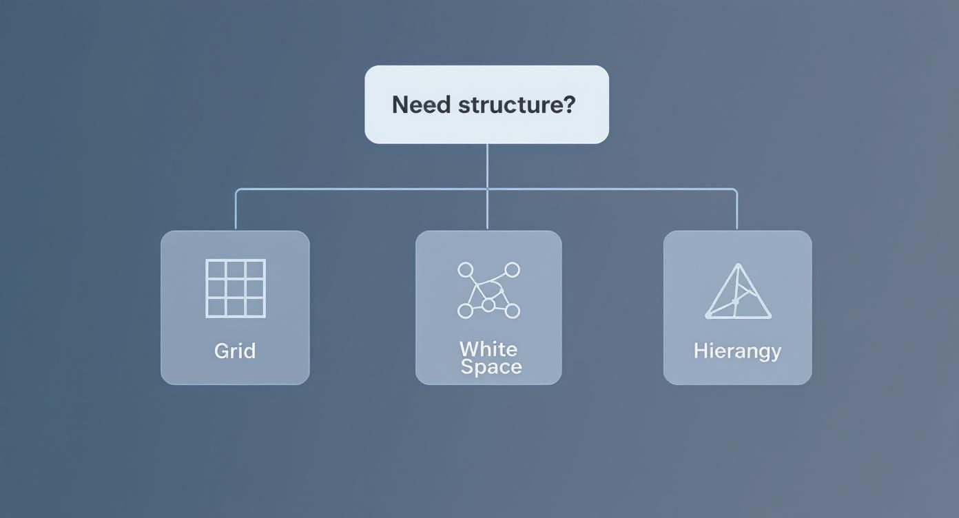
This decision tree helps visualise how to pick a foundational approach for your layout based on what your content is trying to achieve.

As the diagram shows, even though a grid provides the skeleton, it’s the principles like hierarchy and spacing that really bring a design to life and make it effective.
Modern and Mobile-Friendly Patterns
Beyond those classic scanning patterns, a couple of other structures have really become staples of modern web design.
Single-Column Layout: This is the undisputed champion of mobile-first design. By stacking everything vertically in one column, you create a dead-simple, scrollable experience that just works on any screen. It’s perfect for storytelling, blogs, and any page where you want to lead the user through a linear narrative without any distractions.
Card-Based Layout: If you're displaying a collection of similar items—products on an e-commerce site, articles on a news portal, or pieces in a portfolio—cards are your best friend. Each "card" is a neat, self-contained package of information (an image, a title, a brief description) that’s incredibly easy to scan. This modular style is also naturally responsive.
The right layout pattern isn’t just a design choice; it’s a user experience strategy. By picking a structure that matches your content's purpose, you create a frictionless path that helps users find what they need and encourages them to take action.
The single-column approach, in particular, is dominating the scene right now. In the UK, mobile-first design is the clear frontrunner, with around 73% of companies expected to be using this strategy by 2025. This isn’t just a trend; it’s a direct response to the fact that most people are browsing on their phones. Simple, scrollable layouts are more critical than ever. You can learn more about these UK web design statistics and what they mean for the industry.
Ultimately, choosing the right pattern is the first major step toward building a layout that works for everyone.
Building Layouts That Work on Any Device

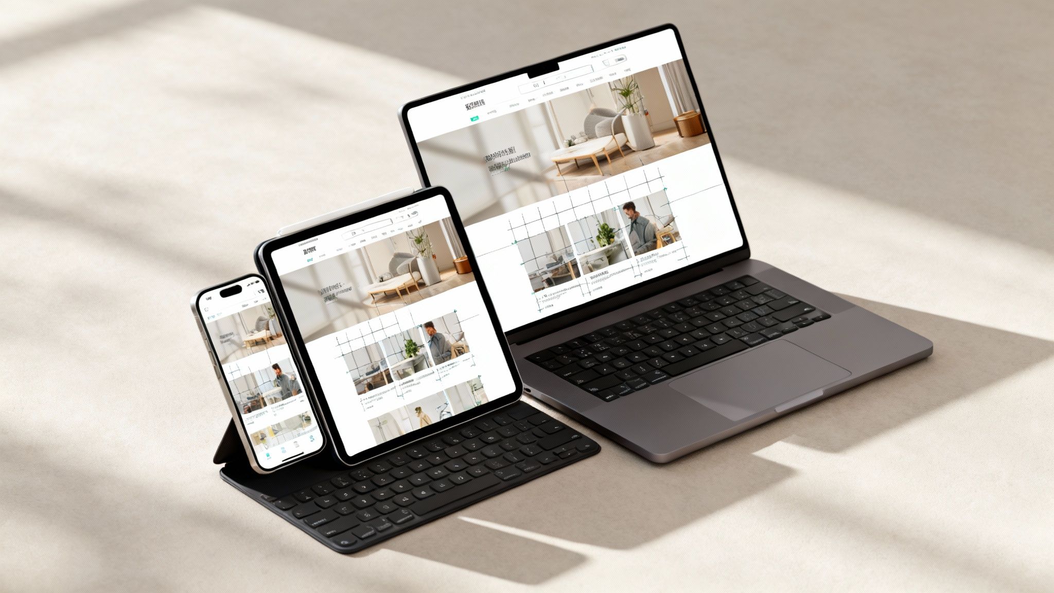
These days, people will find your website on everything from a tiny phone in their pocket to a massive desktop monitor. A rigid, one-size-fits-all layout just doesn't cut it anymore. Your design has to be a chameleon, seamlessly adapting to provide a great experience, no matter the screen.
This flexibility comes down to two main approaches: responsive and adaptive design. Think of responsive design like water; it fluidly fills whatever container you pour it into. On the other hand, adaptive design is more like a set of nesting dolls, with a few distinct, pre-built layouts served up based on the screen size it detects.
While both have their uses, responsive design has become the go-to standard for its incredible flexibility and efficiency.
Adopting a Mobile-First Mindset
The most effective way to tackle responsive design is with a mobile-first strategy. This means you start the design process on the smallest screen—a smartphone—and then progressively enhance the layout for larger devices like tablets and desktops.
Starting small forces you to prioritise. You have to decide what’s absolutely essential, which naturally leads to a cleaner, more focused user experience. This isn't just about making things better for mobile users; it results in a better website for everyone by cutting out the clutter right from the start.
A mobile-first approach isn't just a technical workflow; it’s a strategic decision. By designing for constraints first, you build a faster, more focused, and ultimately higher-performing website for everyone, regardless of their device.
Putting this into practice relies on a few core technical pillars that allow your layout to stretch, shrink, and reorganise itself gracefully.
The Technical Toolkit for Responsive Layouts
To bring a fluid, responsive layout to life, designers and developers lean on three key components working together. Getting a handle on these is fundamental to creating truly device-agnostic experiences.
Fluid Grids: Instead of using fixed pixel widths (like 960px), a fluid grid uses relative units like percentages. An element might be set to 50% of the screen width, ensuring it always takes up half the available space, whether on a narrow phone or a wide monitor.
Flexible Images: Just like fluid grids, images are sized with relative units to stop them from ‘breaking’ the layout on small screens. You can set an image to have a maximum width of 100%, which allows it to scale down proportionally without ever spilling out of its container.
CSS Media Queries: This is where the real magic happens. Media queries are simple filters in your code that apply specific styles only when certain conditions are met, like the screen being below a certain width. For instance, you can tell a two-column layout to stack into a single column on any screen narrower than 768 pixels.
For teams building on specific platforms, knowing how these principles are implemented is crucial. If you're looking for platform-specific guidance, our deep dive into creating a mobile responsive Webflow site breaks down the practical steps and best practices.
Designing for Performance and Accessibility
Let's be honest, a beautiful layout doesn't mean much if the page takes an age to load or if some people can't even use it. Performance and accessibility aren't just tick-box exercises you do at the end; they're the bedrock of any good layout. They have a direct line to your user experience, SEO rankings, and even how people see your brand.
Every design choice you make has a real, technical consequence. Overly complex layouts with tons of nested elements, huge unoptimised images, or heavy-handed animations will bring your page to a crawl. This stuff directly hits metrics like Google's Core Web Vitals, which are all about measuring how fast a site loads, how quickly you can interact with it, and whether things jump around on the screen.
A slow, clunky site is frustrating, and that frustration costs you visitors and money. Thinking about performance from the very beginning of your layout process isn't just good practice—it's essential for creating a site that people actually enjoy using.
Optimising Layout for Speed
A speedy website starts with smart layout decisions. The good news is you can build something that performs brilliantly without having to sacrifice your visual flair. It's all about being efficient from day one.
Here are a few key techniques to build speed into your layouts:
- Lazy Loading: For those long, scrolling pages, make sure images and videos below the fold only load when the user actually scrolls to them. This one change can massively slash your initial load time.
- Minimising Layout Shifts (CLS): Always give your images and other media elements defined dimensions. This stops the page content from annoyingly jumping around as it loads—an issue measured by Cumulative Layout Shift.
- Simplified DOM Structure: Keep your structure clean. A simple, logical hierarchy with fewer nested containers is just plain easier and faster for a browser to figure out and display. If a simpler structure works, use it.
By building these habits into your workflow, you create layouts that just feel fast and responsive. If you want to go deeper on this, check out our guide on how to make your website fast and why you should.
Integrating Accessibility into Your Layout
Accessibility is really just about designing for everyone, including people with disabilities. A logical, well-structured layout is the foundation of an accessible website, making it far easier for tools like screen readers to understand and navigate your content.
"An accessible design is not a compromise; it’s a better design. A layout that is clear, predictable, and easy to navigate benefits every single user, not just those with disabilities."
In the UK, making your site accessible is fast becoming a legal and business must-have. A huge trend in web page layout design for 2025 is the widespread adoption of standards like WCAG 2.1 Level AA. This is being driven by new regulations and a much-needed awareness of inclusive design.
Practically, this means things like ensuring your site can be navigated with just a keyboard, checking that your text has a colour contrast ratio of at least 4.5:1, and providing descriptive alt text for images so screen reader users know what's there. You can discover more insights about these UK web design trends and their impact.
The UK Web Design Market Explained
Before we get too deep into the weeds of grids and pixels, it’s worth taking a step back to understand the commercial reality of web design here in the UK. This isn't just about making things look pretty; it's about carving out a space in a seriously crowded and sophisticated market. Once you see the sheer scale of the industry, the value of investing in a top-notch web page layout design really clicks into place.
The UK sector is mature, but it's far from static. It’s teeming with thousands of agencies and freelancers, all vying for the same eyeballs. In this kind of environment, a generic, cobbled-together website is worse than useless—it’s invisible. A thoughtful, user-focused layout has shifted from being a nice bonus to an absolute must-have for any business that wants to be taken seriously and actually convert visitors.
Market Size and Competition
The UK web design scene is huge. Projections for 2025 put the industry at 2,206 active businesses, pulling in around £658.2 million in revenue. Even with some market fluctuations, the number of businesses continues to climb, which tells you one thing: it’s a resilient and fiercely competitive field. You can dig into the UK web design industry's performance numbers if you want the full picture.
With thousands of providers out there, standing out is everything. Your website's layout is your first, and arguably best, shot at showing you're a professional outfit, building immediate trust, and delivering an experience your competitors simply can’t. A seamless user journey is a massive business asset.
This level of competition changes the game for how businesses need to think about their online presence. For small to medium-sized companies, working with the best UK Webflow agency can be the difference-maker, bringing in the specialised skills needed to build a site that not only looks incredible but also hits tangible business goals. The aim is to transform your website from a digital brochure into your most powerful engine for growth, and every single layout decision is a strategic step toward that goal.
Common Web Page Layout Questions Answered
When you're first getting your head around web page layout design, a few questions always seem to pop up. Nailing the answers to these early on can save you a world of headaches and help you build better sites from day one.
I've rounded up some of the most common queries I hear. Think of this as your no-fluff guide to the foundational concepts that really matter.
What Is the Most Important Layout Principle?
If I had to pick just one, it would be visual hierarchy. Hands down. It’s the art of arranging everything on the page to show what’s most important, guiding a visitor’s eye from a big, bold headline down to a call-to-action button without them ever having to think about it.
Get it wrong, and your page feels like a cluttered mess where users don't know where to look first. A solid hierarchy is the absolute bedrock of a layout that feels intuitive and actually works.
Should I Use a Grid System for Every Website?
For pretty much any website you’ll build, the answer is a firm yes. A grid system is the invisible skeleton that brings order, consistency, and a professional polish to your design. It makes aligning elements a breeze and is absolutely essential for creating responsive layouts that look great on any device.
Sure, a wildly artistic or experimental site might break the grid for dramatic effect, but for 99% of business websites, a grid isn’t a limitation—it’s the reliable framework that lets your creativity shine.
What Is the Difference Between a Wireframe and a Mockup?
It’s simple: a wireframe is the blueprint, and a mockup is the visual model. They’re two distinct and crucial stages in the design journey.
- Wireframes are the bare-bones, low-fidelity sketches. They're often just grey boxes and lines, focusing entirely on structure, where things go, and how the site will function.
- Mockups are the high-fidelity, full-colour versions. They’re static images that show you exactly what the final page will look like, complete with the actual colours, typography, and imagery.
You always want to move from wireframe (the structure) to mockup (the visuals) before a single line of code gets written. If you're looking for ways to speed up this initial phase, it's worth exploring how people are using AI to design your website for generating concepts.
Ready to turn clicks into customers with a high-performing, conversion-focused website? Derrick.dk specialises in custom Webflow builds that pair clean visual execution with robust development. Book a call to diagnose issues and ship a Webflow site that converts.
Webflow Developer, UK
I love to solve problems for start-ups & companies through great low-code webflow design & development. 🎉

.jpg)


