Designing Mobile Website Experiences That Drive Conversions
%20(1).avif) Written by Derrick Kityo
Written by Derrick KityoA complete guide to designing mobile website experiences that convert. Learn battle-tested strategies for startups and SaaS companies in the UK.

You can't just shrink your desktop site and call it a day anymore. Proper mobile design means building a version of your site specifically for smaller screens. Think big, readable text, touch-friendly buttons, and lightning-fast load times.
The key to getting this right is a mobile-first design philosophy. You start with the smallest screen, nail that experience, and then scale up to tablets and desktops. It’s a complete reversal of the old way, and it guarantees the essentials are perfect for the vast majority of your visitors.
Why a Mobile-First Approach Is a Must for UK Businesses
Let's get straight to the point: everyone is on their phone. For UK startups and SaaS companies, your mobile site isn’t just a nice-to-have; it's a core part of your growth engine. A clunky, slow, or confusing mobile experience doesn't just annoy people—it actively damages your brand, kills lead generation, and shrinks your revenue.
For most potential customers, your mobile site is the first handshake with your brand. A bad first impression is often the last one you'll get.
The Real Cost of a Bad Mobile Site
The consequences of ignoring your mobile audience are stark and easy to measure. We’re well past the point where mobile optimisation is just a recommendation; for UK web design, it’s non-negotiable.
Over 84% of visitors now expect a flawless mobile website, and with 77% of all searches happening on a mobile device, this is your main front door. The stakes are huge: a staggering 57% of users won't recommend a business with a poorly designed mobile site. And as of July 2024, Google has stopped indexing sites that aren't mobile-friendly, which means you might as well be invisible. You can explore more data on these trends and see how they're hitting UK businesses.
Here's a quick look at how mobile design choices directly affect your bottom line.
Mobile Experience Impact on Business Metrics
This isn't just about making things look pretty. It's about commercial survival.
A SaaS prospect who can’t easily find the "Book a Demo" button on their phone is a lost lead, period. An e-commerce shopper whose product page lags is an abandoned cart. These aren't minor hiccups; they're critical business failures.
Turning Mobile Design Into Your Competitive Edge
Switching your mindset to mobile-first gives you an immediate advantage. It forces you to be ruthless with your priorities, focusing only on what truly matters to your users. The result is a sharper, more effective website on every device.
- Skyrocket Your Conversions: A simple mobile journey with clear calls-to-action and fuss-free forms makes it incredibly easy for users to take that next step, whether that's signing up for a trial or hitting "buy now."
- Boost Your Brand's Credibility: A fast, intuitive, and polished mobile site screams professionalism. It shows you respect your customers' time and builds trust from the very first click.
- Dominate Search Rankings: With Google's mobile-first indexing, a properly optimised mobile site is one of the most important levers you can pull for better SEO and more organic traffic.
Ultimately, getting your mobile design right is about meeting your customers where they are. This guide will walk you through the exact steps to do just that, helping you turn a potential liability into one of your most powerful growth assets.
Building Your Foundation with a Mobile-First Strategy
Before you even think about firing up a design tool, the real work begins. A successful mobile site is born from a clear, deliberate strategy, not just by shrinking down your desktop version. This is the discovery phase, where we translate what the business needs into a blueprint built specifically for the mobile user.
Think about it: mobile users are a different breed. They're often on the go, distracted, and need answers now . They have zero patience for complex menus or hunting for a button. Your strategy has to respect that reality by focusing ruthlessly on the most critical user journeys. A solid grasp of fundamental user experience design principles is non-negotiable here; it's all about putting the user's goals first.
This handy flowchart breaks down the mobile-first process, showing how a solid discovery phase helps you sidestep common design traps and ultimately gives you a serious edge.
As you can see, getting this initial stage right is what separates a high-performing mobile site from a frustrating, bounce-inducing one.
Defining Your Mobile User Personas
First things first: who are you building this for? And more importantly, what are they trying to do on their phone right now ? Your desktop visitor might be a marketing manager leisurely researching your product. Your mobile visitor is more likely a startup founder trying to book a demo while waiting for a coffee.
Let's sketch out a few action-focused personas to bring this to life:
- The "Urgent Problem-Solver": This person is actively looking for a fix to a problem they're having. They need to understand your solution instantly and see a dead-simple path to signing up or getting in touch.
- The "Curious Browser": They might've seen a post on social media or heard about you from a friend. They're casually scrolling, and you have about three seconds to grab their attention with a clear value prop and content that's easy to scan.
- The "Existing Customer": They just need to log in, find a help doc, or check their account. For them, it's all about frictionless access. Marketing fluff just gets in their way.
This kind of thinking forces you to be disciplined. You have to cut the clutter. If an element on the page doesn't directly help one of these users achieve their goal, it's just noise.
Crafting a Lean Information Architecture
With your personas in hand, it's time to map out the site's skeleton—its Information Architecture (IA). A mobile-first approach here means being absolutely ruthless. Ditch the idea of porting over every single page from your desktop site. Instead, laser-focus on the critical path to conversion.
What's the one thing you want users to do? For most SaaS startups, that’s booking a demo or starting a trial. Every single structural decision should gently nudge them toward that goal.
This is where you start sketching out the essential screens and how they connect. You're not worried about colours or fonts yet; you're just defining the flow. A great next step is to translate this map into a tangible layout. Learning more about https://www.derrick.dk/post/creating-a-wireframe can help you turn this structural plan into a low-fidelity visual, making sure your strategic foundation is rock-solid before a single pixel of visual design is created.
Translating Strategy into Tangible Mobile Designs
Alright, this is where all that strategic groundwork starts to pay off and become something you can actually see and touch. We’re moving from abstract ideas about user needs and business goals to a concrete design, starting with rough sketches and building up to a high-fidelity prototype that feels like the real deal.
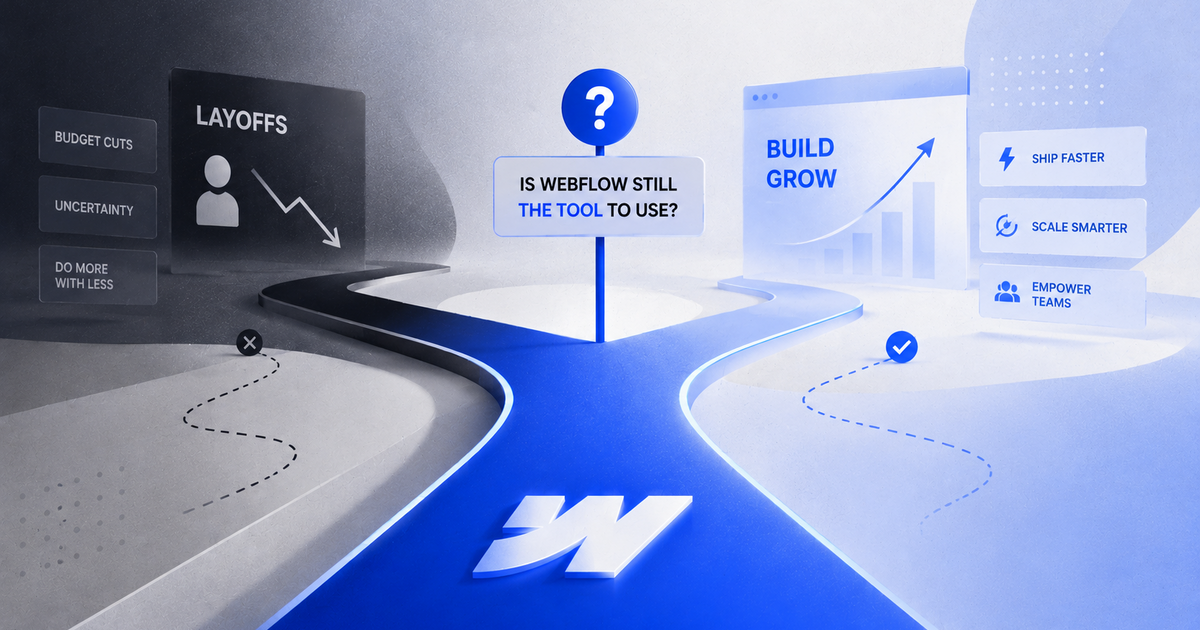
Honestly, this phase is critical. It’s where you turn your mobile-first strategy into an actual user experience. The first few steps aren't about making things pretty; they're all about nailing the structure, hierarchy, and flow. Think of it as drawing up the architectural blueprints before you start picking out paint colours. Getting this right early on will save you a world of headaches (and money) before you even think about building in Webflow .
From Simple Sketches to Interactive Prototypes
The first thing you’ll produce is often a low-fidelity wireframe . This doesn't have to be fancy—a quick paper sketch or a barebones digital layout in a tool like Figma is perfect. The goal here is pure function. You're simply figuring out where everything goes: the navigation, the main call-to-action (CTA), the value proposition. No colours, no fonts, no distractions.
Once you’re happy with the basic layout, you can move on to high-fidelity prototypes . These are the detailed, interactive mock-ups that look and feel just like the final website. Here, you’ll bring in your brand’s visual identity—typography, colour palettes, and imagery. Linking these screens together in Figma creates a clickable prototype that lets you simulate the entire user journey.
Having this interactive model is invaluable. Stakeholders can click through the flow themselves, and more importantly, you can run early user tests. You get to watch real people try to book a demo or find your pricing page, gathering crucial feedback long before a single line of code is written.
Designing for Touch, Not Clicks
One of the biggest mental shifts in mobile design is moving from a mouse-and-cursor mindset to a touch-first approach. People interact with their phones directly and physically, which brings a whole new set of rules to the table. If you ignore them, you're just building frustration into your site.
The most common source of mobile usability issues is what I call the 'fat finger' problem—interactive elements that are too small or crammed too close together. It’s the digital equivalent of trying to press a tiny button while wearing mittens.
To avoid this, you have to obsess over hit targets and gestures. Every single tappable element needs to be big enough to be hit accurately and without stress.
- Generous Button Sizing: Apple’s Human Interface Guidelines suggest a minimum target size of 44x44 points , and Google recommends 48x48dp . Stick to these religiously. It ensures users can tap with confidence and not hit the wrong thing by mistake.
- Adequate Spacing: Always leave plenty of breathing room around your interactive elements. This is especially vital in navigation menus or lists where multiple links are stacked together.
- Intuitive Gestures: Don't reinvent the wheel. Use common mobile gestures that people already know, like swiping for image carousels or pinching to zoom. These are native behaviours that feel natural and require zero learning curve.
Perfecting Mobile Native Components
Some website components need special attention on mobile. A design that’s perfect on a desktop can feel clunky and awkward on a small screen if it’s not properly adapted.
Mobile Navigation Menus
The classic hamburger menu (the three little lines) is a common pattern, but it's not a silver bullet. Hiding your main navigation can seriously hurt discoverability. If your site only has four or fewer key pages, consider a visible tab bar at the bottom of the screen. It keeps the most important actions permanently within thumb's reach.
Mobile Forms and Input Fields
Forms are, without a doubt, the biggest friction point for mobile users. Nailing your form design is non-negotiable if you care about conversions.
- Simplify to the Essentials: Be ruthless. Only ask for the absolute minimum information you need. Every extra field you add is another reason for someone to give up and leave.
- Use Large, Clear Fields: Make sure your input fields are tall with big, readable labels. Little things like automatically bringing up the numeric keyboard for a phone number field make a huge difference to the experience.
- Break Up Long Forms: If you have a more complex process like a multi-step signup, chop it up into smaller, digestible chunks. A clear progress bar helps users see the light at the end of the tunnel.
By focusing on these touch-centric details, your prototype evolves from a simple picture of a website into a realistic simulation of the final product. This lets you gather truly meaningful feedback, fine-tune the experience, and hand off a design to your Webflow developer that's already been tested and is ready to perform.
Mastering Responsive Design Patterns in Webflow
You’ve got a solid, user-tested prototype. Fantastic. Now it's time for the real magic: translating that static design into a living, breathing website in Webflow . This is where your mobile-first concept learns to adapt beautifully to any screen it meets.
The goal isn't to build a bunch of separate sites for different devices. That’s old-school thinking. Instead, we’re creating a single, fluid system where every component knows how to reflow and rescale gracefully. This way, whether someone lands on your site from a tiny smartphone or a massive desktop monitor, the experience feels intentional and seamless.
Building From the Mobile Basepoint
Always start with mobile. Seriously. Your mobile design is the bedrock of the entire build. In Webflow, this means styling all your core elements—typography, buttons, spacing—for the smallest viewport first.
This mobile-first approach is a game-changer for efficiency. Why? Because styles in Webflow cascade upwards to larger breakpoints. You only need to add or tweak styles as the screen gets bigger, instead of fighting to strip down a complex desktop design. It’s cleaner, way more organised, and saves you from a world of headaches.
Core Webflow Layouts: Flexbox and Grid
Webflow puts two incredibly powerful CSS tools at your fingertips, no code required: Flexbox and Grid. These are your best friends for creating intelligent, responsive layouts.
- Flexbox for One-Dimensional Layouts: Perfect for anything you need to align in a single row or column. Think navbars, a row of feature cards, or a group of buttons. Flexbox gives you easy control over alignment, spacing, and wrapping—ideal for components that need to stack on mobile and sit side-by-side on desktop.
- Grid for Two-Dimensional Layouts: When you need control over both rows and columns simultaneously, Grid is your go-to. It’s built for more complex page structures, like a dashboard interface or a multi-column blog feed. Grid offers pinpoint control over how your entire page structure reflows across different devices.
Getting comfortable with both will let you build just about any layout you can dream up, knowing it will stay robust and predictable. If you want to go deeper, it’s worth exploring the fundamentals of what responsive web design truly entails and how these tools are the key to unlocking it.
My personal rule of thumb is simple: if you need to align a group of items along one axis, start with Flexbox. If you're designing a full page structure with rows and columns, reach for Grid. Don't overcomplicate it.
Implementing Common Responsive Patterns
As you start scaling your design from the mobile basepoint, you’ll run into a few common components that need special attention. Here’s how to handle them in Webflow.
Adaptive Navigation
The navigation menu is usually the first thing that needs a responsive strategy. A hamburger icon is a classic space-saver on mobile, but on a desktop, you want those links visible and ready to click.
- Mobile: Use Webflow’s built-in Nav component. It comes with the hamburger menu ready to go.
- Tablet: You can stick with the hamburger or, if you have just a few menu items, switch to a more visible tab bar.
- Desktop: Hide the hamburger icon completely and display the full list of navigation links, usually arranged horizontally with a little help from Flexbox.
Fluid Typography and Spacing
Stop using pixels for font sizes. Hard-coding sizes is a recipe for awkward text and inconsistent spacing across screens. Instead, embrace relative units that scale with the viewport.
Using these units in Webflow for your fonts, margins, and padding helps create a design that breathes. It scales smoothly instead of making jarring jumps between fixed breakpoints.
Responsive Images
Images are often the heaviest assets on a page, so getting them right is critical for a fast mobile experience. Luckily, Webflow does a lot of the heavy lifting for you.
When you upload an image, Webflow automatically creates multiple sizes of it. It then intelligently serves the most appropriate version based on the user's device and screen size. A mobile user gets a smaller, faster-loading image, while someone on a 4K display sees the crisp, high-resolution version.
Your only job? Make sure your images are compressed before you upload them. Give Webflow a well-optimised file to start with, and its responsive image features will take care of the rest.
By combining these layout tools and responsive patterns, you’ll be able to transform your mobile prototype into a fully functional, adaptable Webflow site that just works , no matter how people find you.
Optimising for Mobile Performance and Accessibility
A beautiful mobile website that takes forever to load or is impossible for some people to use is a commercial failure. Plain and simple. Once you’ve nailed the responsive design, the real work begins—the technical tweaks that separate high-performing sites from the ones that bleed conversions. Performance isn't just a nice-to-have; it's a direct driver of your bottom line.
Beyond raw speed, your site has to be usable by everyone. Accessibility isn’t just an ethical box-ticking exercise; it’s a massive part of modern SEO and brand integrity. When your site is accessible to the widest possible audience, you're reaching more customers and building genuine trust.
Supercharging Your Site Speed in Webflow
Slow-loading pages are absolute conversion killers. The financial hit from a poor mobile experience goes way beyond just missing out on traffic; it translates directly into lost revenue. For every ten seconds it takes a site to load, the bounce rate skyrockets by 123% . UK retailers, for instance, lose an estimated £2.6 billion a year from slow websites, with 45% of users reporting bad experiences that lead to a catastrophic 60% bounce rate .
Webflow gives you a fantastic starting point for performance, but you can always push it further with a few clever moves.
- Aggressive Image Optimisation: Before an image ever touches your Webflow project, run it through a compression tool like TinyPNG . For decorative images or backgrounds, think about converting them to WebP for a much better compression-to-quality ratio. This simple pre-upload step can slash your page weight.
- Enable Lazy Loading: This is non-negotiable for any page with more than a couple of images. By setting images to "Lazy load" in Webflow, you're telling the browser to only download them as the user scrolls them into view. This massively improves the initial page load time, getting the important stuff in front of your visitor faster.
- Minify Your Code: Webflow handles HTML minification automatically, but you should also minify your CSS and JavaScript. This process strips out unnecessary characters like comments and whitespace from the code, making the files smaller and quicker for browsers to download. You’ll find these toggles in your site's publishing settings.
A fast website feels professional and trustworthy. It's a clear signal to your visitors that you respect their time, which is the first step in building a positive relationship before they even read a word of your copy.
A Practical Accessibility Checklist
Making your site accessible means designing for people with disabilities, including visual, motor, auditory, and cognitive impairments. Following the Web Content Accessibility Guidelines (WCAG) is the industry gold standard. Here's a practical checklist to get you on the right track.
Semantic HTML and Keyboard Navigation
First things first: use the right HTML elements for the job. That means using <h1> for your main heading, <nav> for navigation, and <button> for, well, buttons. This "semantic HTML" provides a clear structure that screen readers can interpret, helping visually impaired users understand the page's layout and content hierarchy.
Next, make sure every interactive element—links, buttons, form fields—can be reached and used with just the Tab key. Many users with motor disabilities rely on keyboard navigation. If they can't tab to your "Book a Demo" button, you've just lost a lead. Webflow's default components are generally keyboard-friendly, but always double-check your custom interactions.
Colour Contrast and Readability
Text has to be clearly readable against its background. The WCAG AA standard requires a contrast ratio of at least 4.5:1 for normal text. Use a tool like WebAIM's Contrast Checker to verify your colour palette. This is especially vital for calls-to-action—a low-contrast button is practically invisible to users with certain visual impairments.
A well-designed mobile site is also fundamental for effectively improving ecommerce conversion rates , as it places a huge emphasis on user experience and performance. When users can easily read and interact with your site, they are far more likely to convert. For a deeper dive, check out our guide on how to make your website mobile-friendly .
Mobile Performance Optimisation Checklist
To bring this all together, here’s a quick checklist of actions you can take directly within Webflow to boost your mobile performance. Think of this as your go-to list for a final performance pass before launching.
Following these steps will not only make your site feel snappier but also contribute positively to your SEO rankings and user satisfaction. A faster, more accessible site is a win for everyone.
Testing, Launching, and Driving Continuous Improvement
Getting your mobile site live isn’t the finish line; it’s the starting pistol. The real work is just beginning, shifting from creation to observation and refinement. A great launch is less about a single grand reveal and more about putting a solid process in place for testing, monitoring, and constantly improving the user experience. This is how your site goes from being a static project to a dynamic asset that actually adapts to your users' needs.
Creating a Bulletproof Pre-Launch Protocol
Before you even think about flipping the switch, a thorough testing protocol is your best defence against embarrassing bugs and usability nightmares. The goal here is simple: catch the problems before your audience does. This isn't just about making sure pages load; it's about simulating the real-world, often chaotic, conditions your users will actually be in.
You need to test across a whole matrix of variables to ensure everyone gets a consistent experience. A frantic founder trying to load your site on a patchy 4G connection in a café needs it to work just as smoothly as a marketing manager on a lightning-fast office network.
Here’s a practical breakdown of what that looks like:
- Cross-Device Testing: Don't just check it on your own phone. Get your hands on a range of actual devices—older iPhones, various Android models from different brands, and a few different-sized tablets. Emulators are a decent start, but nothing beats seeing how your site really behaves on real hardware.
- Browser Compatibility: Sure, Chrome has a huge market share, but users on Safari , Firefox , and even Edge deserve a flawless experience. You’ll want to check for rendering quirks, broken layouts, or scripts that just don’t fire across all the major browsers.
- Network Condition Simulation: Use your browser's developer tools to throttle your connection speed. Simulating a slow 3G network is a humbling experience that will quickly expose performance bottlenecks you’d completely miss otherwise.
Your Final Pre-Flight Checklist
To keep everything organised during the final push, a pre-launch checklist is non-negotiable. It’s the only way to make sure no small detail falls through the cracks.
- Finalise SEO Settings: Go back through Webflow and double-check that every single page title, meta description, and Open Graph setting is correctly configured. Make sure your robots.txt file is correct and a sitemap has been generated and submitted.
- Verify Analytics Integration: Confirm that your Google Analytics or other tracking scripts are firing correctly. The easiest way is to use the real-time reports to see if your own visit registers before you go live.
- Test All Forms and CTAs: Submit every single form on the site. Seriously, every one. Does the data go where it's supposed to? Do the confirmation messages actually appear? Do all the call-to-action buttons link to the right place?
- Proofread Everything: One last pass for typos and grammatical errors is always worth it. A tiny mistake on a key landing page can be a real credibility killer.
The most valuable insights don't come from what you think users will do; they come from watching what they actually do. Post-launch analytics are your direct line into the user's mind.
Driving Improvement After Launch
Once your site is live, the data starts flowing in. This is where you switch from building to optimising. Your mission now is to use real user data to find friction points and make informed decisions for the next iteration.
Tools like Google Analytics are your starting point, but to really understand the why behind the numbers, you need to go deeper. This is where qualitative tools come into play.
- Heatmaps: Tools like Hotjar or Clarity show you exactly where users are clicking, tapping, and scrolling. A heatmap might reveal that everyone is tapping on a non-interactive element, which is a clear signal that your design is confusing.
- Session Recordings: This is my personal favourite. You get to watch anonymised recordings of actual user sessions—it's the closest you can get to looking over a user's shoulder. You'll quickly spot where they get stuck, hesitate, or get frustrated and leave.
When you combine the hard numbers from analytics with the human insights from heatmaps and recordings, you create a powerful feedback loop. You might spot a high drop-off rate on your pricing page in Analytics, then watch a few session recordings to see people repeatedly struggling with a confusing form field. This data-driven approach takes all the guesswork out of improving your mobile site and ensures every change you make is a meaningful step forward.
Ready to build a high-performing Webflow site that turns your mobile traffic into customers? At Derrick.dk , we specialise in creating conversion-focused websites for startups and SaaS companies. Book a call with us today to diagnose your current site's issues and start shipping improvements that drive real results.

.jpg)