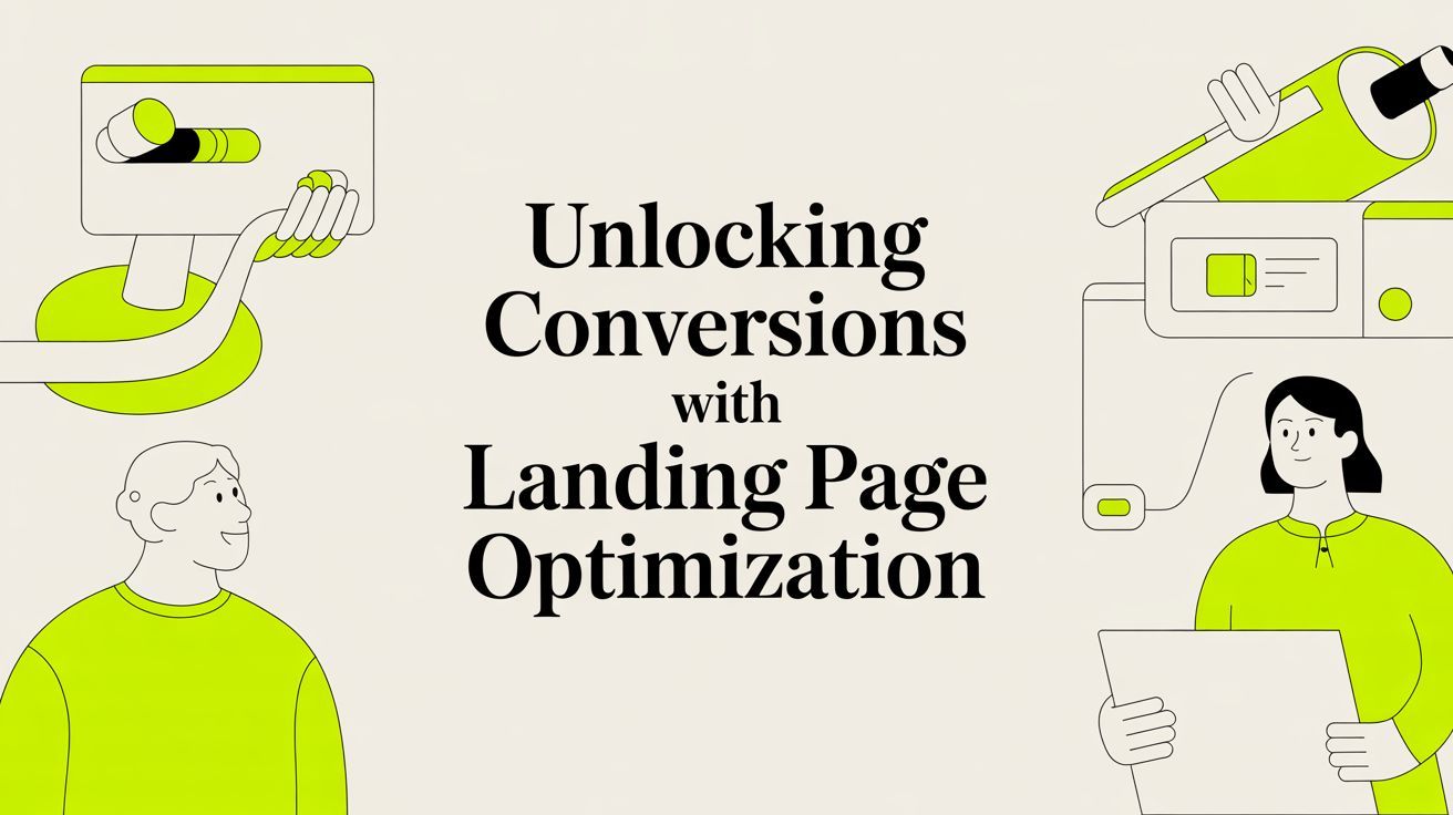
Unlocking Conversions with Landing Page Optimization
%20(1).avif) Written by Derrick Kityo
Written by Derrick KityoDiscover how to turn visitors into customers. This guide covers actionable landing page optimization techniques for auditing, copywriting, and A/B testing.
Landing page optimization is really just a fancy way of saying you’re methodically tweaking elements on a page to get more people to click that button. It's not a full-blown redesign. Instead, it’s about making smart, data-driven changes to your headline, copy, forms, and calls-to-action to convince more visitors to sign up, book a demo, or buy.
Why Your Beautiful Landing Page Is Failing
It’s a story I hear all the time from SaaS founders and marketing teams. You’ve poured a ton of time and cash into a landing page that looks incredible. The design is slick, the branding is on point, and you’ve even pushed a decent amount of traffic its way. But the numbers don’t lie: the sign-ups are trickling in, demo requests are few and far between, and the bounce rate is just painful to look at.
This happens when we forget what actually drives conversions. A pretty design is great for grabbing attention, but it won’t build trust or push someone to act on its own. A successful landing page is a careful blend of different factors, from how clear your message is to how quickly the page loads.
Moving Beyond Aesthetics
Great landing page optimization means treating your page less like a digital brochure and more like a specialist salesperson with one job and one job only. To do that, you have to stop worrying about what "looks good" and start focusing on what the data tells you actually works . This means getting into the weeds of user behaviour to figure out where they're getting stuck, what’s confusing them, and what truly motivates them.
The framework we use at Derrick.dk is all about getting tangible results, not just guessing what might work. This infographic breaks down the core process into three key pillars.
As you can see, everything starts with analytics. The data you gather informs your content and design decisions, which are then validated through technical execution and testing.
The True Goal of Landing Page Optimisation
Your page probably isn't failing because of a single broken button. It’s far more likely there’s a gap between what your audience needs to see and what your page is actually showing them. Optimisation is how you close that gap. The process boils down to a few key activities:
- Data-Driven Audits: Using analytics and UX tools to figure out the real reason visitors are leaving without converting.
- Compelling Copy: Writing headlines and body copy that hit on your customer's biggest problems and offer a clear solution.
- Conversion-Centred Design: Using visual hierarchy, social proof, and clean layouts to naturally guide users towards your main call-to-action.
- Technical Performance: Making sure your page is fast, mobile-friendly, and technically solid, especially when you’re building in a platform like Webflow .
By focusing on these areas, you shift from saying, "I think this looks better" to "I know this performs better." It’s a systematic approach that turns an underperforming page into a reliable lead and sales machine. This guide will walk you through exactly how to do it.
Auditing Your Landing Page with Real Data
Before you touch a single word or tweak a button colour, you need to know what’s actually happening on your page. The most effective landing page optimization starts with a solid audit. Diving into a redesign without any data is like trying to find your way through a new city blindfolded – you might get there eventually, but it’ll be down to pure luck.
A proper audit isn't about becoming a data scientist overnight. It’s about knowing which numbers to look at and pairing them with real human behaviour to understand the why behind your current conversion rate.
Uncovering the Numbers in Google Analytics 4
Your first port of call should be your analytics platform, which for most of us is Google Analytics 4 (GA4). It’s easy to get lost in there, so let’s focus on the metrics that tell a clear story.
Head over to the Pages and screens report and filter it down to your specific landing page URL. Once you’re there, zero in on these numbers:
- Views: How many times has the page been seen?
- Users: How many unique individuals have actually visited?
- Average engagement time: This is a big one in GA4. If this is just a few seconds, it’s a massive red flag that visitors aren't finding what they expected and are bouncing straight off.
- Conversions: This is the payoff. You need to have your conversion goals set up for this to be useful, but it shows you exactly how many visitors took the action you wanted them to.
Looking at these metrics together gives you a baseline. For instance, tons of views but a dismal conversion rate points to a major disconnect. People are showing up, but something on the page is stopping them cold. If you're just getting started with this, our website audit checklist offers a more structured way to tackle it.
Seeing What Your Visitors See with UX Tools
GA4 tells you what is happening, but it rarely tells you why . That’s where user experience (UX) tools like Hotjar or Microsoft Clarity become your secret weapon. These tools are absolute game-changers, turning abstract data points into a visual story of how people interact with your page.
Heatmaps and session recordings are the two features you’ll get the most mileage from here.
Heatmaps and Scroll Maps
A heatmap gives you a visual breakdown of where people are clicking, moving their mouse, and how far they’re scrolling. Hot red spots show where all the action is, while cool blue areas are being ignored.
You might discover people are furiously clicking on a fancy graphic that isn’t actually a link, which tells you your design is misleading. Or a scroll map could reveal that 80% of your visitors never even make it to that crucial testimonial section you placed at the bottom.
This kind of insight is pure gold. It immediately shows you what’s working and what’s being completely overlooked.
Session Recordings
Think of session recordings as a screen recording of a real, anonymised user browsing your page. You get to watch as someone moves their mouse around, hesitates over a form field, or rage-clicks a button that’s not working for them.
Honestly, watching just five or six of these can be more insightful than staring at charts for an entire afternoon. You’ll spot friction points you never would have imagined. Maybe everyone is struggling to find the pricing, or the headline just isn’t making sense to them. This qualitative feedback provides the context that raw numbers can never give you.
Here in the UK, this approach has been a massive win for startups. Data from Ruler Analytics shows that professional services firms hit an average conversion rate of about 5.5% , which blows the all-industry average of 2.9% out of the water. This really drives home how pages tailored to specific channels, like organic search (which converts at 4.2% for these firms), get far better results.
By putting the quantitative data from GA4 together with the qualitative insights from UX tools, you get the full picture. You'll end up with a list of diagnosed problems—not just guesses—ready to be prioritised and fixed.
Rewriting Your Copy and Redesigning for Conversions
Right, you’ve done the hard work, dug through the data, and now you have a much clearer picture of what’s happening on your landing page. The next step? Turning those insights into actual changes that move the needle.
When it comes to landing page optimization , it boils down to two things: the words you use (your copy) and how you present them (your design). They absolutely have to work in harmony to create a smooth, persuasive journey that takes a visitor from mildly curious to fully converted.
This isn't about tearing everything down and starting again from a blank canvas. Think of it more like a strategic tune-up, using your audit findings to strengthen the weakest links in your user's experience.
Crafting Copy That Actually Converts
Let's be blunt: your landing page copy has one job. It needs to convince visitors that what you're offering is the absolute best solution to their specific problem. To do that, it must be crystal clear, compelling, and focused entirely on them—not on you.
So many startups stumble here, falling into the trap of listing features instead of selling benefits.
A feature is what your product does . A benefit is what the user gets . Your visitors only really care about the latter.
- Feature: "Our software has an AI-powered analytics dashboard."
- Benefit: "Make smarter business decisions in minutes with automated insights, no data scientist required."
See the difference? The benefit speaks directly to a user's goal or pain point. You need to go through every single line of your copy, from the main headline down to the tiniest button, and keep asking, "What's in it for them?" For a much deeper look at this, our guide on writing copy for your website is a great place to start.
Nailing the Headline and Call-to-Action
Your headline is, without a doubt, the most critical piece of copy on the entire page. It's the first thing people read, and if it doesn't immediately connect with the ad or link that brought them there, they're gone. A killer headline mirrors the user's intent and spells out your core value proposition instantly.
Just as crucial is your call-to-action (CTA). Vague, uninspired buttons like "Submit" or "Click Here" are conversion killers. Your CTA should feel like a natural extension of your value proposition, making it obvious what the user gets by clicking.
Small tweaks here can bring big results. Making your CTAs more personal and benefit-driven can convert 42% more visitors than generic ones. And pages with a single, clear CTA can hit a 13.5% conversion rate , easily beating pages that offer too many choices. Even a subtle word change can make a massive difference; one UK-based test saw a 31.4% jump in signups just by using the search-exact term 'design' instead of 'build'. You can dig into more of these proven CRO tips to see what works.
Tiny wording changes can have a huge impact on whether someone clicks your button. Moving from a generic command to a benefit-driven invitation makes all the difference.
CTA Copy Optimization Examples
As you can see, the optimised versions are clearer, more personal, and directly answer the user's question: "What happens when I click this?"
Key Takeaway: Your CTA isn't just a button; it's the final step in a conversation. Make it feel like a natural conclusion, not an abrupt demand. Instead of "Subscribe," try "Join 10,000+ Marketers."
Designing for Clarity and Trust
Once your copy is sharp, the design's job is to elevate it. Conversion-focused design isn’t about flashy animations or trendy gradients; it's about creating an unmistakably clear path to your CTA. This all comes down to a strong visual hierarchy.
Visual hierarchy simply means arranging elements on the page to show their order of importance. Your most crucial bits—the headline, the CTA button, key benefits—should grab the most attention through their size, colour, and placement.
Whitespace is your best friend in this process. Giving key elements room to breathe reduces cognitive load, making your page much easier to scan and digest. It naturally draws the eye toward what matters, saving your page from that cluttered, overwhelming look that sends visitors running.
Building Credibility with Social Proof
No matter how persuasive your copy is, visitors will always have a healthy dose of scepticism. Social proof is your secret weapon for overcoming that doubt. It's tangible evidence from real people that your offer is legitimate and delivers on its promises.
Here are the most effective types of social proof to sprinkle throughout your page:
- Testimonials: Real quotes from happy customers, ideally with their name, company, and a photo. Video testimonials are even better if you can get them.
- Case Studies: A quick summary of a client's success story, focusing on specific, measurable results. Think numbers.
- Customer Logos: A simple but powerful way to show you’re trusted by other recognisable brands.
- Trust Badges: Any security seals, industry awards, or partner badges that build credibility at a glance.
Don’t just dump these at the bottom of the page. Weave them in naturally, especially near your CTA. Placing a powerful testimonial right next to your sign-up form can be the final nudge a hesitant visitor needs.
By combining benefit-driven copy with a clean, trust-building design, you create a landing page that doesn't just look good—it gets results.
Optimising Your Page Speed and Technical SEO in Webflow
You can craft the most convincing copy and have a design that stops people in their tracks, but if your landing page takes an age to load, a huge chunk of your visitors will simply never see it. When it comes to landing page optimisation , speed isn't just a perk; it's a fundamental piece of the user experience that hits your bottom line.
A slow page doesn't just frustrate users. It also sends a bad signal to search engines, tanking both your conversions and your rankings. The good news? If you're building in a platform like Webflow , you have a surprising amount of control over the technical nuts and bolts that dictate your page's performance.
This isn't about learning to be a backend developer overnight. It’s about getting a handle on a few key practices right inside the Webflow editor that will keep your page fast, responsive, and perfectly structured for people and search engines. Let's get into the practical stuff.
Boosting Your Page Load Speed
Page speed is one of the heaviest hitters when it comes to conversion. Research from the UK paints a pretty stark picture: over 50% of pages still aren't optimised for mobile, which costs businesses an average of 8% in conversions . With mobile now driving 83% of traffic , the stakes are incredibly high.
Every single second of load time past the two-second mark can slash your conversions by another 7% . You can dig into more of these stats on conversion rate optimisation in the UK .
Here are the most impactful things you can do in Webflow to speed things up:
- Properly Compress Your Images: This is the absolute lowest-hanging fruit. Huge, uncompressed images are the number one killer of fast landing pages. Before you upload a single image to Webflow, run it through a tool like TinyPNG . Your goal is the smallest possible file size without a noticeable drop in quality.
- Use WebP Image Format: Webflow makes using next-gen image formats dead simple. When you upload an image, Webflow automatically creates a WebP version, which is way smaller than old-school JPEGs or PNGs. Just make sure this is enabled in your project settings.
- Defer Non-Essential Scripts: Got third-party scripts for analytics, chatbots, or tracking pixels? They can seriously slow down the initial page render. In your project settings, you can add defer or async attributes to your custom code. This tells them to load in the background without holding up the rest of your page.
- Be Smart with Animations and Interactions: Webflow's interactions are brilliant, but they can come with a performance cost if you go overboard. Try to avoid heavy, complex animations that trigger on page load. Instead, stick to subtle interactions that trigger on scroll or click to create a smooth experience that doesn't bog down that critical initial load.
Pro Tip: Don't forget to use Webflow's built-in asset cleanup tool. It removes any unused CSS styles or images from your project. One simple click can trim your file sizes and give you a nice little performance boost.
Nailing On-Page SEO Essentials
A fast page is a fantastic start, but you also need to make sure Google can understand what your page is about and why it should show it to people. Good on-page SEO makes you more visible in search results, driving qualified organic traffic your way. It also makes for a better experience once they click through.
Crafting Your Title Tag and Meta Description
Think of your title tag and meta description as your landing page's personal advert on Google. They don’t directly affect page speed, but they have a massive influence on whether someone actually clicks on your link.
- Title Tag: This is the main blue link people see in search results. It needs to be concise (under 60 characters ), include your main keyword, and scream the page's core benefit. So, instead of just "Marketing Software," try something like "AI Marketing Software | Automate Your Campaigns Today."
- Meta Description: This is the little snippet of text underneath the title. While it's not a direct ranking factor, a compelling description (around 155 characters ) is your chance to entice a click. Use it to summarise your value proposition and pop in a call-to-action.
You can edit both of these directly in the page settings panel for any page in your Webflow project.
Structuring Your Content with Headings
Using headings (H1, H2, H3, etc.) correctly is non-negotiable for both SEO and accessibility. It creates a logical hierarchy that helps search engine crawlers—and screen readers—understand the flow of your content.
- Use a single H1: Your main headline should be the one and only H1 on the page. No exceptions.
- Follow a logical order: Don't skip heading levels, like jumping from an H2 straight to an H4. Use H2s for your main sections and H3s for the subsections within them.
- Include relevant keywords: Naturally weave keywords into your headings where it makes sense. This helps signal what each section is about to both users and Google.
By taking control of these technical elements in Webflow, you're building a much stronger foundation for all your other optimisation work. A fast, well-structured page is what gives your brilliant copy and design the chance to actually do their job.
Implementing a Smart A/B Testing Strategy
Optimisation isn't a one-off task. Think of it as a continuous cycle of improvement that keeps your landing page sharp and effective, and A/B testing is the engine that drives it. It’s a beautifully simple method: you pit two versions of your page against each other—an 'A' version and a 'B' version—to see which one actually performs better with a live audience.
When you do it right, A/B testing completely removes the guesswork from your landing page optimisation. Instead of making changes based on a gut feeling ("I think a blue button would look nicer!"), you’re using real user data to make decisions that have a direct, measurable impact on your conversions.
Building a Strong Hypothesis
Every great A/B test I've ever run started with a strong hypothesis, not just a random idea. A hypothesis is a clear, testable statement that connects a change you want to make with an outcome you expect, and—critically—it's grounded in the data you found during your audit.
A weak hypothesis is something like, "Let's make the button green." A strong one, on the other hand, is structured and specific.
Hypothesis Framework: If I [make this specific change], then [this specific metric] will improve because [this is the reason based on my data].
Let's walk through a real-world example. Say that during your audit, you watched a few session recordings and noticed people hovering over your generic "Submit" button for a few seconds before finally clicking. That hesitation is pure gold—it’s the seed of a great test.
- Hypothesis: If I change the CTA button copy from "Submit" to "Get My Free Demo," then form submissions will increase because the new copy clarifies the value and reduces user uncertainty.
Now that's a powerful starting point. It’s measurable, and it directly tackles a problem you've already identified.
Setting Up and Running Your Test
With a solid hypothesis in hand, it’s time to set up the test. Tools like Google Optimize (now part of GA4), VWO , or Optimizely make this surprisingly straightforward. You’ll create a 'variant' of your page with the new change and then split your incoming traffic between the original (the 'control') and the new version.
The hardest part? Patience. You have to let the test run long enough to achieve statistical significance . That's just a technical way of saying you have enough data to be confident the results aren't just a random fluke. Most tools will even tell you when you've hit a confidence level of 95% or higher. Trust me, stopping a test too early is one of the biggest and most common mistakes you can make.
Prioritising Your Tests for Maximum Impact
Especially in a startup or a small marketing team, resources are always stretched thin. You can't possibly test every idea that pops into your head, so you have to be ruthless about prioritisation. This is where a simple impact/effort matrix becomes your best friend.
The idea is to score each test idea based on its potential impact on your goals and the amount of effort it will take to implement. This helps you zero in on the quick wins first—the high-impact, low-effort changes that will move the needle without bogging you down.
Sample A/B Test Prioritisation Framework
Use this framework to decide which landing page tests to run first by scoring potential ideas based on their expected impact and the effort required to implement them.
Based on this quick analysis, the simple copy change is the clear winner. It has a high potential for impact but requires almost no effort. That massive pricing section redesign? It might be impactful, but it's a huge project that can definitely wait.
This kind of structured approach keeps your landing page optimisation efforts focused and efficient. For a deeper dive into the broader strategy, exploring some conversion rate optimisation best practices can provide valuable context. And if you’re selling on a major e-commerce platform, looking into a guide on how to conduct A/B testing on Amazon can offer specific, actionable examples. By testing smart, you build a powerful feedback loop that drives continuous, meaningful improvement.
Your Landing Page Optimisation Questions, Answered
As you get stuck into optimising your landing pages, a few questions always seem to surface. It's totally normal to wonder where to start, or how long you should be waiting for results. So, I've put together answers to the most common queries I hear from startups and marketing teams, designed to give you clear, practical guidance.
Think of this as your go-to reference for those nagging questions that can bring your progress to a halt. Nailing these fundamentals will give you the confidence to test, learn, and consistently push your conversion rates higher.
How Long Should I Run an A/B Test on My Landing Page?
The honest answer? It all comes down to your website traffic. The main goal here is to reach 'statistical significance' —which is just a fancy way of saying you're confident the results aren't a fluke. You need enough data for the outcome to be reliable.
For most landing pages, that means running a test for at least two full weeks, and ideally up to four. This simple step helps to smooth out any odd fluctuations in user behaviour that pop up between weekdays and weekends.
A word of warning: most A/B testing platforms, like VWO or even the tools in Google Analytics, will signal when you've hit a 95% confidence level. It can be incredibly tempting to call it a day if one version pulls ahead quickly, but you have to resist. Ending a test prematurely on a small sample size is one of the fastest ways to get misleading results and make bad decisions.
What Is the Single Most Important Element to Optimise?
If you could only focus your energy on one thing, make it the 'hero' section . This is the prime real estate at the very top of your page—your main headline, sub-headline, and primary call-to-action (CTA). It's the first thing every single visitor sees, and it has about five seconds to make an impact.
That section needs to instantly answer three crucial questions for your visitor:
- Where am I? (Does this page match the ad or link I just clicked?)
- What can I do here? (What is this page all about?)
- Why should I do it? (What’s the big benefit for me?)
If your value proposition isn't crystal clear the moment the page loads, you’ve likely lost a huge chunk of potential conversions. It’s why testing different headlines and value props in your hero almost always delivers the biggest wins.
Can I Perform Landing Page Optimization Without a Developer?
Absolutely. A massive amount of high-impact landing page optimisation can be done without writing a single line of code, especially if you’re using a platform like Webflow. Marketing teams can—and should—feel empowered to own many of these tasks.
Here are just a few things you can tackle without a developer:
- Content Changes: Rewriting headlines, updating body copy, and swapping out images can all be done right in a visual editor.
- CTA Adjustments: Changing button text, colours, and placement is usually a straightforward task.
- User Research: Setting up tools like Hotjar for heatmaps or using Google Forms for on-page surveys requires no dev skills.
- A/B Testing: Many modern testing tools offer visual editors that let you create page variants without needing developer support.
Sure, more technical tasks like advanced schema markup or deep script optimisation might require a developer's help, but you can make enormous progress on your own.
How Many Landing Pages Should My Business Have?
There's some pretty compelling data on this. Companies that increase their number of landing pages from under 10 to between 10 and 15 often see a 55% increase in leads .
The best practice isn't just creating pages for the sake of it. It’s about building a unique, dedicated landing page for each distinct marketing campaign, traffic source, or audience segment you're targeting.
For example, the page you link to from a Google Ads campaign for "SaaS accounting software" should be completely different from the one you promote in a LinkedIn campaign aimed at enterprise CFOs. This approach, known as message matching, lets you tailor the copy and offer perfectly to what the user expects to see. It’s a proven way to send conversion rates soaring.
Ready to turn your landing page into a high-performing conversion machine? At Derrick.dk , we specialise in building and optimising Webflow sites that get real results for startups and growing companies. Book a free discovery call today, and let's diagnose your issues and build a clear path to higher conversions. https://derrick.dk

.jpg)