What is a ui design: A Practical Guide to Interfaces That Convert
Discover what is a ui design and how it boosts engagement and conversions for startups.

Let’s get one thing straight from the start: User Interface (UI) design is the craft of building the visual side of a digital product. It’s everything your customers see, touch, and interact with on a screen—the buttons they click, the text they read, the way a page is laid out, and how it all feels when they use it.
Defining the Role of UI Design in Business

Think of UI design like the interior design of a high-end shop. It's not just about making the space look good; it's about the strategic placement of signs, the logical flow of the aisles, and the design of the checkout counter. It's all done to guide customers smoothly from the moment they walk in to the moment they make a purchase.
Great UI does the same thing for a website or app. It turns a jumble of features into an intuitive, enjoyable, and effective tool that works for both the user and the business.
For any competitive UK startup, UI isn't some fluffy, artistic afterthought. It’s a serious tool for building trust, showing off your brand's value, and converting casual visitors into loyal, paying customers. It’s the bridge connecting your user directly to your business goals.
The Core Components of UI
So, what makes up a strong UI? It’s not just one thing, but a collection of elements working together to create something that feels both natural and intentional.
To give you a clearer picture, here's a quick rundown of the fundamental building blocks of UI design.
Core Components of UI Design at a Glance
These components are the bedrock of any successful digital interface. They work in harmony to create an experience that not only looks good but is also incredibly functional.
For a deeper dive into these fundamentals, you can explore the essentials for modern graphical interface design mastery.
Why UI Matters in the UK Market
In the UK, we've moved past seeing UI as just a pretty layer. It's now a measurable lever for growth. Adobe-backed research found that 71% of UK consumers actively prefer digital experiences that are visually engaging.
And the flip side? 38% of users globally will abandon a website if they find the content or layout unattractive.
For a London-based studio like ours, those numbers are critical. When you consider that UK digital ad spend shot past £26 billion in 2023, every UI decision—from colour contrast to visual hierarchy—becomes a direct tool for boosting conversion in a fiercely competitive market.
The Inseparable Bond Between UI and UX Design
It’s the classic chicken-and-egg question of the digital world: where does User Interface (UI) design stop and User Experience (UX) design begin? The truth is, they’re two sides of the same coin. They have to work together to create a product that people genuinely want to use. Trying to treat them as separate jobs almost always ends in failure.
Think of it like building a house. UX design is the architectural blueprint. It’s the logic and structure—the flow of the rooms, where the doors and windows go, and how the space feels to live in. It answers the fundamental questions: Is the kitchen easy to get to? Does the layout make sense for a family? Is it a practical, comfortable space?
Then you have UI design, which is the interior decoration. This is everything you see and touch: the paint colours, the style of the light fittings, the texture of the furniture, and even the feel of the doorknobs. UI takes the architect’s vision and brings it to life with sensory details that make the house not just functional, but beautiful and enjoyable.
Why You Cannot Have One Without The Other
A product just can't succeed unless both are working in harmony. One provides the logical foundation, the other brings the visual and interactive appeal.
Great UX with poor UI is like that perfectly planned house filled with clashing colours, uncomfortable furniture, and harsh lighting. Sure, you can technically live in it, but the experience is jarring and unpleasant. You’ve got a solid foundation, but nobody wants to spend any time there.
On the other hand, great UI with poor UX is like a stunningly beautiful room that’s impossible to actually use. The furniture might look incredible, but you can't find the light switch, and the door opens the wrong way. It’s all style and no substance, which is a recipe for pure frustration.
"A brilliant UI can't save a bad UX, and a brilliant UX can be ruined by a bad UI. They are not in competition; they are in collaboration."
For startups, getting this synergy right is non-negotiable. Your product has to be both a joy to use and effective at solving a real user problem. Neglecting one side of this partnership means you're only doing half the job—a risk no growing business can afford to take. If you're looking to dive deeper, check out these practical tips to improve your website's user experience.
This balance is fundamental to creating digital products that don't just attract users, but keep them coming back. Our detailed guide to effective website UX design explores exactly how to build that solid foundation from the ground up.
Principles of UI Design That Drive Conversions

Knowing what UI design is and how it partners with UX is just the beginning. To truly turn an interface into a high-performance business tool, you have to lean on a set of core principles. These aren’t abstract artistic rules; they are the practical foundations that transform a screen from something that just works into something that persuades, guides, and encourages action.
Think of these principles as the grammar of visual language. Without them, your interface is just a jumble of elements. With them, you’re crafting clear, compelling sentences that your users can understand in a heartbeat.
Guiding the User with Visual Hierarchy
The first and most critical principle is visual hierarchy. This is all about arranging elements on a page to show their order of importance. A brilliant interface doesn't make users think; it naturally pulls their eye to the most important thing first, then the next, and so on down the line.
You pull this off by playing with contrasts in size, colour, and placement. A large, brightly coloured "Get Started" button will always demand more attention than a small, grey text link. It's just how our eyes work.
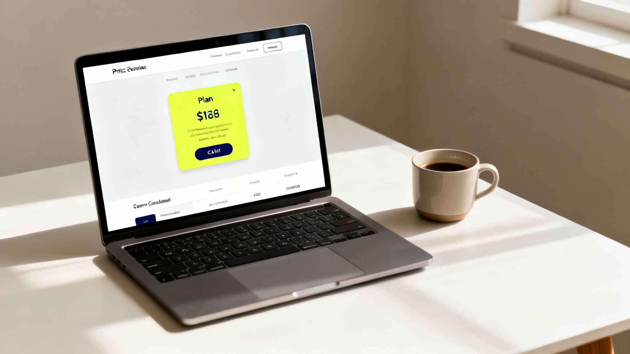
Take a pricing page, for example. The plan you want most users to pick is often made a little bigger, given a bolder colour, or highlighted with a "Most Popular" banner. This isn’t trickery; it’s clear guidance that cuts down on hesitation and friction, directly boosting conversion rates. A strong hierarchy turns a potentially confusing page into an obvious path forward.
Good UI design is not about decoration; it's about communication. Every element should have a purpose, and that purpose should be instantly clear to the user. This clarity is what builds trust and drives results.
Building Trust Through Consistency
Consistency is the quiet hero of a great user interface. It simply means that similar elements look and act in a predictable way across your entire product. Buttons should all share the same style, navigation menus should stay put, and the fonts you use should follow a strict set of rules.
This predictability builds a powerful sense of familiarity and trust. When users instinctively know what to expect, they feel more confident and in control. They aren't forced to relearn how your site works on every new page, which reduces their mental effort and keeps them focused on what they came to do. Inconsistent design, on the other hand, just creates confusion and chips away at trust, often leading people to give up and leave.
Providing Clarity and Feedback
Finally, a top-tier UI is crystal clear and responsive. Clarity is about stamping out any shred of ambiguity. Icons need to be universally understood, labels should be short and sharp, and instructions have to be completely straightforward. If a user ever has to pause and guess what a button does, the design has stumbled.
Just as important is interactive feedback. When someone clicks a button, the interface must immediately acknowledge it. This could be a subtle change in colour, a loading spinner, or a quick confirmation message. This feedback loop reassures users that the system is working and has received their command, stopping them from clicking again or thinking the site is broken. They might seem like small details, but these moments are essential for creating a smooth and satisfying journey.
For anyone looking to dig deeper into the foundational aspects behind these principles, you can explore the core elements of visual design in more detail.
How Great UI Design Directly Impacts Business Growth
We’ve talked about the principles that separate good UI from bad. Now, let’s connect those pixels on the screen directly to the pounds in your bank account. For any founder or business leader, this is the most important part of the conversation: UI design isn't just an expense; it’s a powerful engine for growth.
A clear, intuitive interface directly influences your most important business metrics. How? By systematically cutting out user friction at the most critical moments in their journey. Think about those make-or-break interactions, like a customer navigating your checkout process or a potential lead trying to fill out a trial signup form.
When the UI is confusing, cluttered, or inconsistent, users hesitate. They get frustrated, they lose trust, and a surprising number of them will simply give up. This leads directly to lower conversion rates, higher bounce rates, and wasted marketing spend. A great UI does the opposite—it makes the desired action feel effortless.
Turning Clicks into Customers
Every single element of your interface—from the colour of a button to the clarity of a form field—can either add friction or remove it. By stripping that friction away, you make it far easier for users to say "yes" at every step. This isn't just a theory; it's a proven driver of revenue.
From a performance perspective, UI design in the UK is increasingly defined by conversion and retention metrics. A recent report synthesising data across SaaS and fintech products showed that structured UX/UI redesigns—involving clearer visual hierarchy, more legible typography, and simplified forms—produced an average 31% uplift in conversion rates and up to a 50% improvement in user engagement. For UK startups paying for traffic, a 31% conversion gain on the same media budget is often the difference between a viable customer acquisition cost and an unscalable funnel. You can dig into more of these findings on arounda.agency.
Investing in a high-quality user interface is one of the most effective ways to lower customer acquisition costs. It ensures every marketing pound you spend works harder by converting more of the visitors you’ve already paid to attract.
The Financial Benefits of Great UI
The impact of a well-executed UI goes far beyond a one-time conversion boost. It creates a ripple effect across your entire business model, generating value that compounds over time.
A strong UI can lead to:
- Increased Customer Lifetime Value (LTV): When an interface is easy and pleasant to use, customers are more likely to stick around. This reduces churn and increases the total revenue you earn from each one.
- Lower Support Costs: An intuitive design answers user questions before they’re even asked. It prevents confusion, meaning fewer people need to contact your support team for help just navigating the product.
- Stronger Brand Perception: A polished, professional interface signals quality and trustworthiness. This strengthens your brand's reputation and makes it easier to attract and retain high-value customers.
Bringing Your Vision to Life with Figma and Webflow
Great UI principles are one thing, but the real magic happens when a beautiful concept turns into a high-performing website. This is where the modern tech stack shines, bridging the gap between a designer’s vision and a developer’s execution with incredible speed and precision. For today’s top studios, this process hinges on two powerful tools working in perfect harmony.
The journey usually kicks off in Figma, the collaborative design tool where UI designers craft every visual detail of your website. Think of it as the digital drawing board for creating pixel-perfect mockups, interactive prototypes, and a complete design system. This isn't just about making things look pretty; it's about locking in every button, colour, and layout before a single line of code gets written.
From Static Design to Dynamic Website
Once you’ve given the thumbs-up to the design in Figma, the next step is to bring that static vision to life. This is where Webflow takes centre stage. Unlike traditional coding, which can be slow and often leaves room for interpretation errors, Webflow lets developers build visually. The result? The final website is a perfect match for the approved Figma design.
This modern workflow offers some serious advantages for startups:
- Speed to Market: The Figma-to-Webflow process dramatically cuts down development time, getting your product or marketing site live far quicker than old-school methods.
- Pixel-Perfect Precision: What you see and approve in the Figma design is exactly what you get in the final build. No more frustrating back-and-forth about tiny discrepancies.
- Team Empowerment: Once the site is built, Webflow’s user-friendly editor lets your marketing team update content, add blog posts, or tweak copy without needing a developer for every little thing.
This streamlined approach doesn’t just build websites; it builds assets that can adapt and grow with your business. It puts the power of iteration directly into the hands of the people driving your growth.
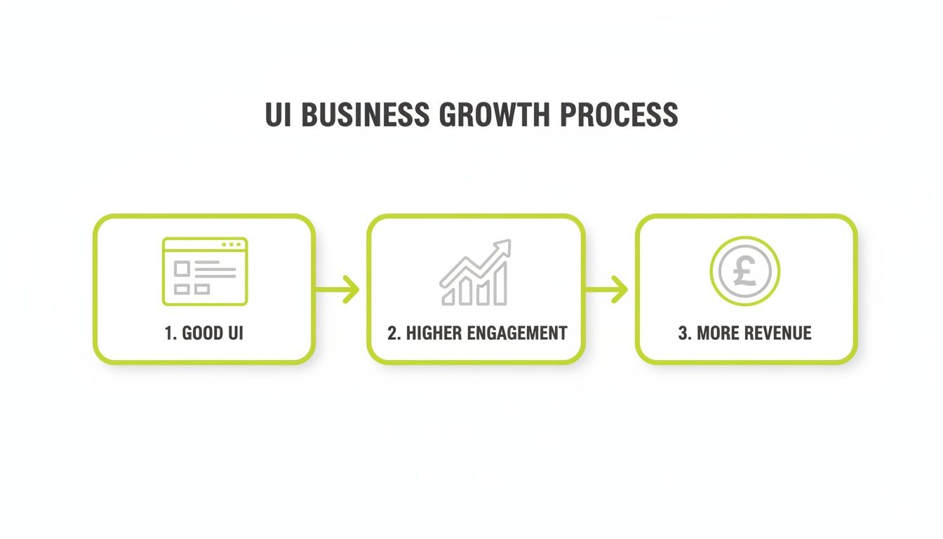
The following graphic shows exactly how this investment in good UI directly fuels business growth.

This process flow illustrates a clear and powerful business reality: a superior interface drives user engagement, which in turn leads to increased revenue. For those looking to implement this workflow, our comprehensive guide on the Figma to Webflow development process provides a detailed walkthrough.
Choosing the Right Design Partner for Your Startup
When you’re ready to invest in your user interface, the next big question is who you can trust with the job. Deciding between a freelancer, an in-house hire, or a specialised studio can be the difference between a website that just looks good and one that actively grows your business. Each route has its own trade-offs when it comes to cost, speed, and strategic input.
Getting this decision right is critical. The UK software development industry pulled in roughly £55.8 billion in turnover, and that number is expected to hit £62.1 billion by 2026. As companies push more of their services online, every new SaaS product or marketing site lives or dies by its UI.
With 88% of online users less likely to return to a site after a bad experience, startups aren't just competing with each other; they're competing in a market where billions are being poured into perfecting user interfaces. This makes your choice of design partner a vital business decision. You can dig into more UK software development market insights on limeup.io.
Vetting Potential Partners
No matter which model you go for, your vetting process has to go deeper than just scrolling through pretty pictures in a portfolio. You need a partner who gets that UI design is a commercial tool, not just an artistic exercise.
When you’re talking to a potential partner, here are the signals you should be looking for:
- Focus on Business Goals: Their portfolio shouldn't just be a gallery of nice designs. Look for case studies that talk about real results—things like improved conversion rates, better user engagement, or other concrete key performance indicators.
- A Clear Process: They need to be able to walk you through their entire design and development process, from the first conversation to the final launch. A structured approach is a great sign because it minimises risk and keeps everyone on the same page.
- They Ask the Tough Questions: A great partner won't just ask about colours and fonts. They'll start by digging into your business, your customers, and your growth goals. They need to understand the why before they can tackle the what.
The most important question you can ask a potential design partner is: "How do you measure success beyond aesthetics?" Their answer will tell you everything you need to know about whether they're a true growth partner or just a pixel-pusher.
For many startups, a studio offers a powerful middle ground. You get the strategic oversight and diverse skill set of a large agency but with the focused, hands-on approach of a smaller team. It’s a streamlined process built for growth.
Frequently Asked Questions About UI Design
When it comes to putting UI design into practice, startups and marketing teams usually have a few burning questions. Let's tackle some of the most common ones we hear to clear up any lingering doubts.
How Much Does Professional UI Design Cost?
This really depends on the scope of what you're building. A straightforward landing page might run you a few thousand pounds, but a complex web application with lots of moving parts could easily stretch into the tens of thousands.
When you partner with a studio, you're often getting a bundled service that includes both design and development. This usually offers better value because the focus is on achieving a business outcome, not just billing by the hour.
Can I Use a Template Instead of Custom UI Design?
Templates are a quick way to get something online, but they essentially force your unique business into a generic, off-the-shelf box. It's a bit like buying a suit off the rack versus getting one tailored – one fits okay, the other fits perfectly.
Custom UI design creates an interface engineered from the ground up to meet your specific users' needs and smash your conversion goals. If you're serious about standing out and scaling up in a crowded market, a bespoke approach is almost always the smarter long-term investment.
A template gives you a container; custom UI gives you a conversion tool. The former is a starting point, while the latter is a strategic asset built for growth.
How Long Does a Typical UI Design Project Take?
For a standard marketing website, the design phase alone can take anywhere from two to six weeks. This window covers everything from the initial discovery and wireframing all the way through to creating the final, pixel-perfect visual designs.
The good news is that a modern workflow using tools like Figma and Webflow can dramatically speed up what comes next. This integration means the development process is much faster, helping you launch your high-performing site and get it in front of customers much sooner.
Ready to build a website that doesn't just look good, but actively converts visitors into customers? Derrick.dk specialises in turning your vision into a high-performing Webflow site. Book a free discovery call today.
Webflow Developer, UK
I love to solve problems for start-ups & companies through great low-code webflow design & development. 🎉

.jpg)


