When a nice Webflow animation gets in the way
Try two reveals, then check whether your Webflow animation helps someone use the page. Covers mobile, keyboard focus, reduced motion and content without JavaScript.
An animation earns its place when it helps somebody understand or use the page. A tidy reveal can draw attention to a change. A sequence that makes somebody wait for the copy, chase a moving button or fight the scroll needs another look.
I like motion. I also want to be able to read the site while I'm using it. The useful question is what happens when I arrive halfway down the page, move through it with a keyboard or open it on a smaller screen.
Webflow's recent post about animating with Claude and GSAP makes a useful distinction between a rendered video and a live website. A video captures one version. A site has to keep responding to the person using it. The little comparison below is a way to inspect that difference.
The copy stays the same
I've built two reveals for three fictional project cards. The elaborate version moves each card 64 pixels and fades it in over 0.85 seconds, starting the cards 0.25 seconds apart. The smaller version moves them eight pixels over 0.22 seconds, with a 0.05-second stagger and no fade.
That puts the last card's planned finish at 1.35 seconds in one version and 0.32 seconds in the other. These are settings in this example. They aren't measured page-load times or evidence that one version converts better.
Same content, two reveals
An original GSAP example, not an exported Webflow interaction. Motion starts only when you choose a button. Your system's reduced-motion preference always takes priority.
System preference: no reduction detected. Keyboard focus finishes any active reveal so a focused link isn't left invisible.
The content is readable before JavaScript runs.
Build the useful parts
Give the next person a page they can actually maintain.
See the test worksheetCheck the whole journey
Read, navigate and submit it before calling it ready.
See the test worksheetThe example starts still. Choose a reveal to play it.
These are parameters in this demo, not a performance benchmark or a conversion result. Reloading or disabling JavaScript leaves the content visible.
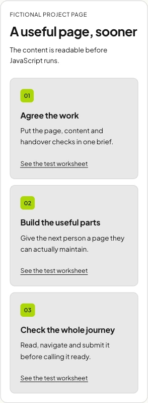
Both versions stop. Neither takes over the page's scroll. You have to choose a button before anything moves, and the system's reduced-motion preference wins over that choice. I wanted the example to expose the difference without making the article itself hard to read.
Try reading the third card while playing each version. Then move to a card link with the keyboard. The example finishes an active reveal when focus enters the cards, so the link doesn't sit invisibly in the middle of a fade.
Say what the motion is doing
“Make it feel more premium” is hard to test. “Show that this panel has opened” gives the effect a clear job. So does connecting an action to its result, or helping someone follow a change in a diagram.
For the cards here, the copy already has an order and each card has a number. The long reveal adds another sequence to wait through. I'd ask whether that extra sequence helps enough to justify the wait. There's no need to claim a universal answer from a small demonstration.
The less visible costs are worth looking at too. Someone has to maintain the trigger, starting state, end state and behaviour at different widths. A future content edit may change the height of the section. If the explanation of an effect takes longer than the explanation of the feature it decorates, I'd simplify it.
A desktop effect needs another decision on mobile
A horizontal row becomes a vertical stack on a narrow screen in this example. That changes what someone sees at once. A stagger that reads as one group on desktop can spread across several scroll positions on a phone.
I'd try the real copy at the smaller width before tuning timings. Longer headings change the card height. Larger text changes it again. The page should keep a readable order when the animation is still, without relying on a pinned section to explain what belongs together.
Touch is another reason to revisit an effect. A hover hint isn't a complete way to reveal information someone needs. A decorative transform shouldn't make a control hard to tap, and a scroll effect shouldn't require a particular swipe speed to reach the next section.
The screenshot here only shows layout at one emulated width. Before approving the actual site, I'd use a phone to read, scroll, rotate it and tap through the main task. Record the device and browser. Don't turn a responsive preview into a claim that every mobile browser has been tested.
Reduced motion needs a useful still version
The browser's prefers-reduced-motion media feature lets the page respond to a person's preference to reduce non-essential motion. It doesn't decide which parts of your design can disappear.
The still version should keep the information and the controls. Stopping an effect on its invisible first frame would leave the person with less of the page. A sensible fallback might show the final state, remove a decorative movement or use a static image that explains the same thing.
Webflow's current GSAP interactions support conditional playback. Its motion guidance discusses “no animation” and “skip to end”. Choose according to the states you've built, then test the result. The setting's name isn't proof that the remaining page is usable.
A local “turn off motion” control can be useful too. In this example it adds another way to stop the effect; it never overrides a system request for reduced motion. I'd avoid a “play anyway” button that quietly ignores the preference someone has already set.
Keep the content visible before the animation runs
The cards above start as readable HTML. JavaScript adds movement after you ask for it. If the script doesn't run, the page still has its headings, explanation and links.
That's a useful starting point for a content page. If the base CSS hides a whole section and a script is supposed to reveal it, a missing script can leave a missing section. Test that failure as part of the build, rather than finding it when someone sends a blank screenshot.
// Keep the cards visible in the base HTML and CSS.
const motion = gsap.matchMedia();
motion.add('(prefers-reduced-motion: no-preference)', () => {
  gsap.fromTo('.feature-card',
    { y: 8 },
    { y: 0, duration: 0.22, stagger: 0.05 }
  );
});
// In a component, call motion.revert() when it unmounts.
// Add a focus handler if your reveal can obscure a focused link.
This short custom-code example only moves the cards; it doesn't hide them. In a component, clean up the animation when the component is removed. GSAP's matchMedia documentation explains how matched animations are reverted as conditions change, and how to use revert() to clear the setup.
Keyboard focus deserves its own check. Someone can tab to a link before a reveal finishes. Either keep that link visible throughout or finish the reveal when focus enters. For a control the user needs immediately, I'd usually avoid fading it out at all.
Native interaction or custom code?
When the effect fits Webflow's interaction controls, keeping it there gives the next designer somewhere familiar to edit it. Custom GSAP can make sense for behaviour those controls don't cover. It also leaves code for somebody to own.
Webflow currently offers both Interactions with GSAP and Classic Interactions. They have different features, including how reduced-motion settings are handled. Check the version comparison before following an older tutorial or adding a second animation system.
The demo here is custom GSAP. It shows a behaviour to inspect; it doesn't certify a native Webflow interaction. In a real project, run the same checks on the published page with its fonts, images, header and other scripts present.
A short test before the page goes live
The worksheet covers the normal reveal, reduced motion, keyboard focus, narrow layouts and JavaScript being unavailable. There's space to record the actual device, result and evidence. It's a starting set of checks, rather than a full accessibility or performance audit.
For a useful review, agree the task first: understand the offer, choose a section or complete the form. Watch whether the effect helps that task, then decide what to keep. If you need a wider set of page checks, the website audit example shows how I turn findings into work somebody can pick up.
Source notes
Documentation checked on 11 October 2026. The reveal timings are explicit parameters in the original demo. Screenshots show the demo's browser rendering; no conversion lift, physical-device result or Webflow workspace test is claimed.
Frequently asked questions
How should a Webflow animation handle reduced motion?
Keep the useful content and controls available in a still version. For GSAP interactions, choose conditional playback according to the states you built, then test it. Stopping on an invisible starting state can leave content missing.
Does a responsive preview prove an animation works on mobile?
No. It can reveal layout problems at a chosen width. Test the published page on actual phones too, including scrolling, tapping, text size and orientation. Record which devices and browsers were checked.
Can I use GSAP matchMedia for reduced motion?
Yes. Match your animation setup to media queries, including prefers-reduced-motion. GSAP reverts the matched animations when conditions change. Use the cleanup appropriate to your page or component.
Should a reveal hide content before JavaScript runs?
For a content page, I'd start with readable HTML and add motion afterwards. Test the page with JavaScript unavailable. If a script is needed to reveal an otherwise hidden section, its failure can leave the section missing.
Does the smaller reveal improve conversions?
This example doesn't measure conversions. Its distances and timings are demonstration settings. Use the page's actual task to judge usability, and collect suitable evidence before claiming a business result.

.jpg)