Your services page should help people rule you out
 Written by Derrick Kityo
A services page can help buyers judge fit before they enquire. Here's how I'd explain scope, limits, pricing questions, evidence and the next step.

A useful services page should help somebody decide you're not the right fit. If they need work I don't offer, I'd like them to find that out before booking a call. The same goes for budget and delivery arrangements.
That's a useful job for the page. The person gets a clearer choice, and the conversation can start with something more specific than working out what the service includes.
It's also a different writing problem from making the business sound impressive. You need to give somebody enough detail to compare your offer with what they actually need.
Give the reader something they can recognise
“We build exceptional digital experiences” leaves quite a lot for the reader to work out. A founder needing a booking system and a marketing team needing a new website could both think it means them.
A more useful explanation names the work and the situation it suits. For example, a service might help an operations team replace an approval process currently spread across spreadsheets and email.
That version gives the reader something to recognise. It also lets a team with a completely different problem move on. I'd choose the specific explanation even when it sounds less grand.
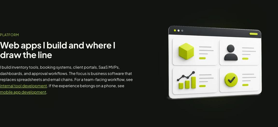
On my own web app development page, I name the kinds of software I build and link to internal tools and mobile development where the job differs. The section is a description of scope. It isn't evidence that the page has improved enquiry quality.
Put the limit next to the promise
If a service includes a website build, the reader may still be wondering about copy, photography, migration, hosting and support after launch. “Full service” doesn't settle those questions.
You don't need to turn the page into a contract. A short explanation near the relevant promise can do a lot. Say whether content is supplied by the client, whether migration needs a separate review and how ongoing changes are handled.
I'd also explain any limit that would change whether someone should enquire. A browser application and a mobile app may solve related problems, but that doesn't make every device feature part of a browser build.
The tone matters. A page can be clear about its boundaries without sounding as though it's arguing with a difficult client. Describe the work you can take responsibility for and what needs another arrangement.
A limitation is most useful before somebody has built a plan around the promise. Hiding it at the bottom of a long FAQ leaves the reader to join the two statements together.
“It depends” needs a second sentence
Sometimes a price or timescale genuinely depends on the brief. The useful response is to explain what changes it.
For a client portal, I'd want to know which users can see which records, what needs moving from the old system and which services it connects to. Those questions tell the buyer why the scope needs a conversation.
If you have a real starting price or planning range you can stand behind, give it enough context to be useful. State what it covers, what it leaves out and what would change it. Don't invent a neat number to fill a gap in the design.
When a range isn't ready, you can still help someone prepare. Explain the information needed for a useful estimate and who will review it. That is more helpful than making every visitor submit a form to discover the first question.
The same applies to timing. An expected build window needs its starting point and dependencies. A date based on approved content means something different from a date measured from the first enquiry.
Want to apply this to your own website or app?
Tell me what you are working on and where it is getting stuck. I will help you turn the useful ideas into shipped work.
Use evidence to answer the next question
A project image can show that you can make a good-looking page. It may leave the buyer's harder question unanswered: can you handle the part of my project that worries me?
For someone replacing a spreadsheet workflow, the useful example might explain the users, permissions and handover. For a marketing site, it might show how the team edits content or what was involved in moving the old pages.
I'd put the relevant project beside the claim it supports. Explain what you did, what you were responsible for and what the example doesn't establish. A named tool or a client logo doesn't describe all of that on its own.
This is also where a studio and an individual practitioner can be easy to confuse. Make clear who is doing the work and how the relationship runs. The distinction matters across my personal work and Hilvy; they shouldn't read as interchangeable promises.
Make the next step a fair exchange
Before asking somebody to book a call, tell them what the call is for. Will you review their brief, discuss whether the project fits or work out what needs investigating?
Then ask for information that helps that conversation. A person with a rough idea may not have a finished specification. Give them a way to explain the problem without pretending every detail has been decided.
Nielsen Norman Group's research on ambiguous “Get started” actions is a useful reminder here. A button label can hide what happens after the click. I'd read the action and its surrounding sentence together, as someone arriving for the first time.
The next step can be modest. A relevant brief, a short fit conversation or an example to inspect may be enough. It should follow from the questions the page has just answered.
Fewer enquiries wouldn't prove the page is better
There's an easy story to tell after making a page more specific: fewer people enquire, so the wrong people must be leaving. That might be true. The page might also have become confusing, or the form might have broken.
I'd check the journey and compare the enquiries themselves. Do people understand the service? Are there fewer surprises about scope? Can the right person take the next step without help?
For each enquiry, keep a simple reason why it did or didn't fit, where you can do that appropriately. Look for a pattern across the actual conversations. Don't call an exit a successful qualification just because it makes the report sound better.
The conversion measurement article covers the events around an enquiry. The judgement about fit still needs information from the person handling it.
Read it as someone comparing three options
Put your page beside a realistic brief and two alternatives. Try to work out what each service includes, what needs clarifying and who you'd be working with. Mark every answer that only exists in your head.
Those gaps are a sensible place to start editing. You might need one clearer sentence, a relevant project or an honest explanation of a constraint. A longer page isn't automatically the answer.
Download the services-page decision worksheet
For planning the page itself, see how I plan a website layout. The website brief template helps with the questions a buyer may bring to the conversation.
Source and example notes
I reviewed my linked service page and the cited design research on 20 October 2026. The screenshot records the page at that point. This article makes no claim about a measured change in conversions or enquiry quality.
Frequently asked questions
What should a services page include?
Explain the work, the situation it suits, what is included, relevant limits, evidence and the next step. Address the questions that would change whether someone should enquire. Choose the order around the buyer's decision rather than a fixed list of sections.
Should I put prices on a services page?
Use a real starting price or planning range when you can explain what it covers and what changes it. If the scope needs review first, explain which decisions affect the estimate and what information will make that conversation useful. Don't invent a figure for the page.
How can a page explain who the service isn't for?
Put a relevant limit beside the promise it qualifies. Describe the work you can take responsibility for and when a different service or arrangement is needed. Keep the language factual and helpful rather than writing a long list of exclusions.
Would fewer enquiries prove that the page qualifies buyers better?
No. Fewer enquiries could also reflect confusing content or a broken journey. Check the page and form, then review the fit and expectations of actual enquiries. Don't treat every exit as evidence that an unsuitable buyer successfully ruled you out.